A PERSONAL HISTÓRY oF FLOMM so far PART 8 of 10
“Have any of you ever actually read the label on Doc Bronner’s 18-in‑1 soap? That is some bonkers shit going on there.”
—Emily Duchaine
“If your website looks like a website, you’ve got a problem.”
—Roger Black, smart guy, 1999
There’s this thing I sort of believe.
And it flies in the face of everything I know about user experience (UX) and user interfaces (UI)s. I’ll get to it in a minute.
It’s sort of the opposite of how websites we have NOW were the result of thirty years of evolution from America Online thru the Dot Com Bust – with two of the major survivors being Amazon and Ebay.
And if you look at Amazon and Ebay, the format – header, footer with vertical content squeezed in between – their layout became the formatting basics.
On the World Wide Web, we never went with horizontal scrolling cause early on it took longer to load.
And when I built my first horizontal scrolling website in protest, I discovered Microsoft Explorer cut off anything that went sideways. (Microsoft Word also cuts off any weird tall ascenders/descenders in my fonts).
Then Google coming up with an awesome search algorithm ended up making all of us slaves to keywords directly in HTML text #TAGS #TAGS #TAGS #TAGS #TAGS sort of finished off How Things Should Look.
Header, nav, footer with vertical content squeezed in between. It’s now wat we expect, or we do that venial sin of engaging with a website: We leave.
BUT. We have a screen in front of us and using HTML (and CSS) it is possible to design a website any damn way we want.
But we don’t.
Cause of retention.
If your website doesn’t have everything you need in a quick to click menu, you’re fucked. And if it’s a three line hamburger menu, well, that debate on rages on.
O, and go capture their email. Mor emails you have, mor valid you are.

“I’ve looked at your value as a site and it sucks.”
—a mediocre photographer told me
If you really want you can buy numbers, but that’s not wat FLOMM is about.
It’s an art project at this point and I’d rather engage with a few real people than thousands who just follow us cause it’s the cool thing to do. (I may deny I said this in the future, but who knos?)
So if They can’t figure it out, They Will Leave. Which is where we are today. Let’s make a website that isn’t easy to figure out.

Because that was the goal of the DADAists: Make everyone fed up so they will leave.
Self-defeating art movement website? Okay then.

“Keep going in this direction and you’ll suffer the same fate as your inspiration.”
—Louis Hernandez, talking about something else
i wanna break the internet
So a messed up website for FLOMM is a given, because when was the last time you were at a website? I mean, isn’t all interaction on social media at this point, not web media??
And I had a few inspirations for FLOMM website stuffs:
Once, AIGA Los Angeles had a website where ALL the images that loaded on the home page randomly appeared with the visual work of different graphic designers as members. As a result, whenever one would hit their site, you’d get the same UI – but a totally different skin/UX. AND THIS WAS FUN.
The Art Directors Club of Houston had this handmade website once with Pantone Chips on their homepage and scribbled lettering that said, These are our colors, you can’t use them. And each link I clicked on led to a page that looked totally different from the other page I clicked on. Like, the website was totally different on each page.
These are two graphic design websites about groups that branding experts join – and they threw the Laws of Branding to the curb. And shit, I want to do that too.
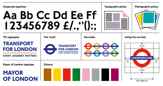
Because güd branding can be a complex experience BUILT on style alone. And I was working at a time (the 1990s) where branding could work harmoniously if the designer just got the ‘look’ of things working consistently – and not everything always needs to be built around just a killer logo (which is a myth).
So with FLOMM I wanted to do just this + deconstruct things a bit, because of DADAism. Making all this a crazy challenge because hey, why not?
Problem tho: I’m not a web programmer.
But as a teacher, I am surrounded by web programmers – because web design is FAR mor in demand than print graphic design (which is sort of why NOW I kno just enough about HTML to be dangerous.)
So, who wants to make the FLOMM! website with me? Any takers?

“Stay afraid, but do it anyway. What’s important is the action. You don’t have to wait to be confident. Just do it and eventually the confidence will follow.”
—Carrie Fisher
eye rolling and senior projects
At my (now closed) school, Graphic and Web Design majors needed to come up with and pitch a Senior Project in order to graduate.
And my view of this process was from outside, I was not the professor in charge of any of this. At the time, I had just about all of them in my beginning courses – and I was kind of a consulting coach when it came to Senior Projects.
And my view was tainted cause I kept running into students who were just – “oh GODDDDDD, I don’t KNOWWWWW what I want to DOOOOOOO.”
Me: “Well, wat are your interests?”
“I don’t KNOWWWWW I just want to GRADDDDDDYOUUUUATTTTTTTEEE.”
I remember sitting there once with 2 brilliant students for, like, 30 minutes until their regular professor shows up and I was attempting to find out ANYTHING AT ALL that might interest these two into something that might – oh – FUCKING WOW an EMPLOYER at a DESIGN STUDIO somewhere where they’d end up doing wat they LOVE – which is supposed to be DESIGNING THINGS.
Because that’s wat their degrees would be in.
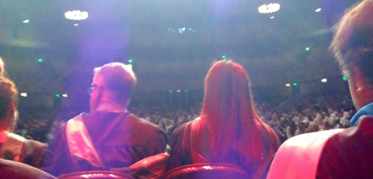
“I really wish the Graphic Design students weren’t so miserable. I thought graphic designers are supposed to LOVE designing things.”
—Bill, again
So did I.
And this led to a talk I give in the very early courses – that students aren’t quite ready for yet but I hope it just hovers in the lateral posterior parietal cortex for a few years:
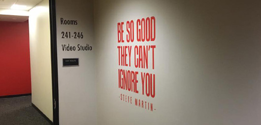
“There are SHIT Graphic Design jobs and there are AWESOME Graphic Design jobs. Wat you put in your portfolio will help determine which sort of job you will get.”
Like, look at one of my former students: The Real Tim Kim.
He fucking loves designing things and he designs for fucking Michelin-level restaurateurs. And I’m pretty sure he loves wat he’s working on today. ANNND, I wanna have lunch with him.
So I kept seeing students tanking their own Senior Projects and ending up in SHIT jobs.
BUT I found the exception to the rule. I ran into Amanda on the stairs, I was heading down, she was heading up and she said:
“I’m building the FLOMM website.”
And I couldn’t get out more than a “But …”
“I’m building it … all of it.”
“But …”
“Doing the design too.”
There was a long pause, because I actually kno better than to argue with a gift like this.
“Okay then.”
difficult website, take one
I was just going to grab some sort of CMS template and throw info on there and mention the game and a few things – but Amanda Burnham had selected the FLOMM website as her Senior Project and she knew wat she wanted to do.
All my talk about how cool it is to do The Hard Things got to her. And it’s awesome when that happens.
And she was determined to push the envelope – beyond wat envelopes do.
So there were a few things we decided on: WordPress environment, so the site can be updated easily over time – we talked about the site not needing a major upgrade over time, where major rebuilds can be done by just moving things around. WordPress can do this and I’m thankful we went in this direction.
And I wanted different layouts for every page. With as many different fonts as possible – as if a group of DADA-thinking artists sat down and decided to make a website out of paper, a printing press and a few boxes of random metal type. In 1923.
The Art Directors Club of Houston site – mor than a dozen years later – may not be saved at Archive.org, but was still stuck in my head.
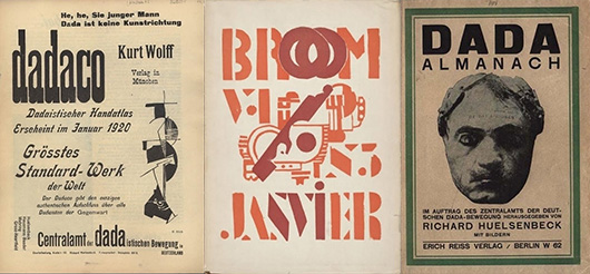
Inspiration for the site design would be similar to the game: The printed output of the DADAists, Futurists, Constructivists, the Bauhaus and anything and everything that relates to those categories.
Because I have books to reference! And our school had a killer library with books I couldn’t afford but recommended they have in the stacks. Hah!
And today, a lot of these original Modern pieces can be found in PDF form at the Monoskop website, or, of course, you can see the original originals at Letterform Archive in San Francisco.

difficult website, take two
This collaboration took three whole quarters and two Senior Project classes. And I did step in as co-designer along the way; because this was a CRAZY DIFFICULT undertaking.
And from seeing how the FLOMM game was developed, Amanda set up everything where it could change on the fly because I have random idea in the shower and want to include it.
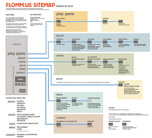
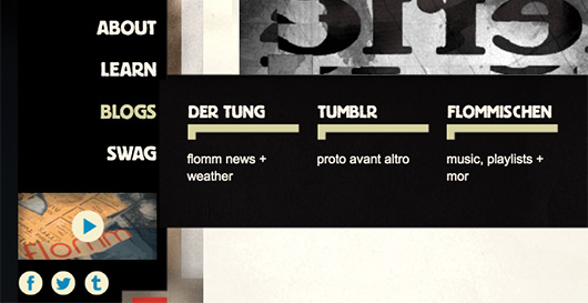
Typical web development doesn’t work that way – but it did lead to some unusual sections and compromises. Our main nav became a black rectangle and Amanda pulled the heavy lines from my site map and used em directly as pointers:
tung time!
Somewhere along the way, we decided we needed an on-site blog – in addition to our Tumblr presence.
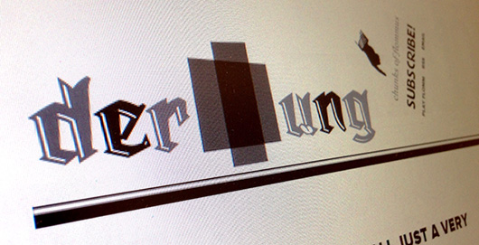
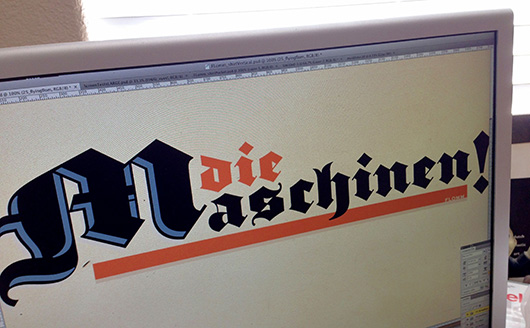
The blog was simply set up for FLOMM news and PR bullshit – but the idea of DER TUNG with a Plakatstil-style newspaper masthead – using type from the legendary Michael Doret – and a tongue, that was a shower thought.
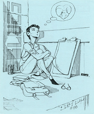
So was turning DER TUNG into a reincarnation of a weekly ’zine I edited in college: THE MONDAY MORNING BLUES. Free, uncensored speech – from opinion to fiction to poetry to comics was our thing. To make, a handful of us used to use an old Apple IIe with a basic word processing program hooked up to an inky typewriter-like dot matrix printer for our text. Then art was photocopied to fit (it actually was hard to find a copier that allowed enlarge and reduction at the time), paste-up was done by hand (wax and x‑Acto knives!), we used to print using cheap paper plates on a barely functioning A.B. Dick offset press, fold and hand collate, then distribute about 3,500 copies every Monday to students at the College of San Mateo.
The MMB was a successful concept at the time – luckily we didn’t recruit too many psycho writers, but once word got out ‘we’d print anything,’ by my third year, content just came pouring in.
Did over 100 issues while I was at the school (found my final edition’s cover here, I posted it below. The Tower Records-employed illustrator went on to direct movies or something.)
Maybe with DER TUNG, my nightmares about paste up/ printing/ collating/ distribution might finally stop.
“Remember the MMB? Well, it’s taken me over 30 years and my own personal fortune but I’ve recreated it as an online blog called DER TUNG.”
—Me to Lysa, one of my writers over 30 years ago
“Haaahaaah. That’s nice, Steve.”
—Lysa, cuts me off and applies for AARP
DER TUNG started October 2014 and the first posts were pretty much me blogging my Bauhaus course – then I opened it up to writers and artists I knew and it veered into wat it is today:
FLOMM Littéraire Blog posting FLOMMIST writings from everywhere.
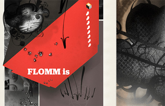
Elsewhere, the site’s original ABOUT intro was difficult to build – and I ended up overhauling it a couple times on my own (after we moved on beyond the game), leaving the code intact and updating the imagery.
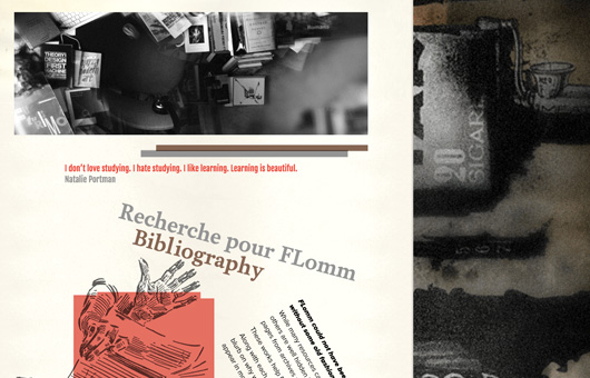
The LEARN section contains the Bibliography for my game research, a page of outside links (which I haven’t updated in years, but Amanda figured out how to zig zag the type), a sarcastic ‘student-written’ essay (which at one point, someone who reviewed the game – in another language – took at face value), and something I’ve always loved: Our Historic Muses of FLOMM page.
“Nobody normal ever accomplished anything great.”
—Bwargh von Modnar
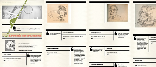
Tis true. Amanda came up with the Muses format – based on the design work of El Lissitzky – with each entry providing not just biographic information and a quote, but links to online sources to research these luminaries.
Additionally, ‘unlabeled’ illustrations randomly between the listings – just click on them if you want to kno who they are. I recruited illustrator David Powers to help me sketch out a bunch and I’m still not sure David ever really got wat we were trying to do here. Make the page interactive. So you know, someone can play with the damn thing.
All of the artists, designers and performers on the Muses page accomplished things that motivate me to create; maybe they can inspire you too.
“From handlettering to historical fonts, typography is the backbone of FLOMM.”
—intro, FLOMM Fonts page
Typography plays an important role in FLOMM.
And I used a LOT of it in the game (as images) AND the website.
So much we sort of broke Adobe Typekit before we even launched our site. Because, as I was told by someone at Adobe, “Normal people don’t make websites like this.” And I saw a couple years later, goofy sites like FLOMM.us aren’t supported in their EULA.
The short end of all of it is: If I want a pile of fonts as HTML at the site, I have to limit things to just a handful. Or pages will take DAYS to load or something.
So we settled on some nice basics: James Todd’s serif Garvis, Mark Simonson’s Proxima Nova, Stefan Hattenbach’s Luminance, Matts Griffin and Braun’s Fatboy revival of George Nesbitt’s 1828 Ultra Wide Egyptian, and my own Niedermann Grotesk.
Then we added the beautiful and quick loading (nü at the time) Google fonts of Eben Sorkin because I met Eben in San Francisco (at the TYPO Conference) and we ended up going for a long walk thru the San Francisco Mission looking for a place he knew of that sells incredible Saffron Ice Cream.
He told me about his type contract with Google and how he was making their webfonts collection awesome (in 2014 it wasn’t awesome, it kinda sucked). And in the years since, I’ve passed on his carefully crafted + curated collection anytime I found myself teaching Typography for the Web.
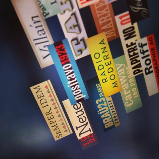
Everything else listed on the Fonts page we sort of shoehorned in. Sorta. And just for the challenge, most of the rectangle ‘specimens’ on this page were designed when I had nothing to do for about 2 hours.
Yes, I can design quickly if I wanna.

“Fashion is the armor to survive the reality of everyday life.”
—photographer Bill Cunningham
fashion forward flomm
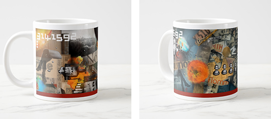
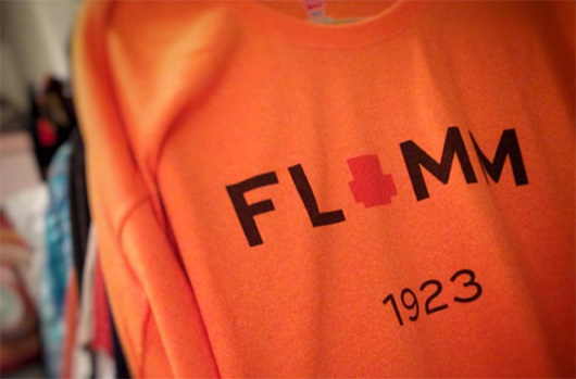
My plan was to release a bunch of FLOMM merchandise to help pay for wat we’ve been doing – in addition to any income from the game itself.
I decided to use Zazzle for fulfillment. Because their prints, mugs and postcards come out BEAUTIFUL.

And because they’re ‘on demand’ made one-at-a-time printing, I don’t have a bunch of product lying around, there’s no pre-ordering costs, there’s something a bit eco-friendly about this structure, you can pick your own shirts and colours AND if there’s only a few made, you can be the only one on your block sporting FLOMM merch!
I wanted to do a series of tees, buttons and stickers with all the FLOMM characters on them – and because I’d promised Rikki Morehouse a fashion shoot years earlier for something else that never happened – we set up with photographer Kaylah Hammer and VFX artist Kevin Harbaugh AND a bunch of slides of the locally iconic Sacramento Water Tower + electricity grid – we booked ourselves into a photo studio and started shooting away.
For twenty minutes. Because Security showed up and threw us out of the building.
Because somehow none of us had the right permissions to be there. Tho the results of our 20 minute shoot are on our MERCH page.


And Rikki – who would later give up graphic design and join the circus and really expand the definition of who really is a FLOMMIST in our little group here – ended up having her body parts floating around the FLOMM game.
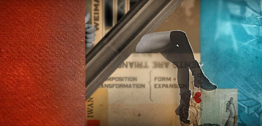
Because of muses Raoul Hausmann + Hannah Höch. And because of Karel Teige.
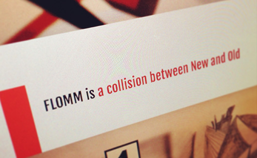
site launched, kinda done?
Anyone whose developed a website knos it’s never actually done.
And yeah, that’s wat actually works here – in our 5th year since going live, we do little updates to and fro + the WordPress CMS keep it flowing.
Amanda continued working on the site until her graduation – we launched with our unfinished experiment – and we ended up with a HUGE play now link at the top of the main menu, right below the over 100 FLOMM logos that load randomly.
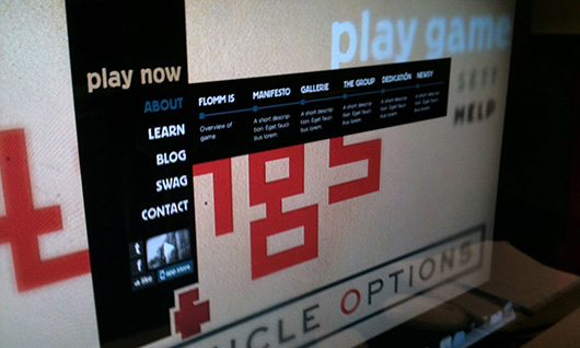
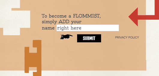
AND YOU CAN ACTUALLY SIGN our MANIFESTO. We have a SIGNATURE FIELD just to see if ANYONE is willing to sign – as an art project. We don’t collect anything ’cept a name. And we did get mor responses than we were expecting.
Are people afraid to sign? Of course they are. And so it’s fun to see who actually is willing to do it.
Amanda was snagged up almost immediately after leaving school and like, she’s fucking coding everything everywhere because SHE’S AMAZING.
Like, imagine if ALL the graduates of our school approached their Senior Projects like she did?
OMG, I’m such a fucking dreamer!
Along the way, Kevin Harbaugh finished up the game trailer that was abandoned by the other guy 6 months earlier.
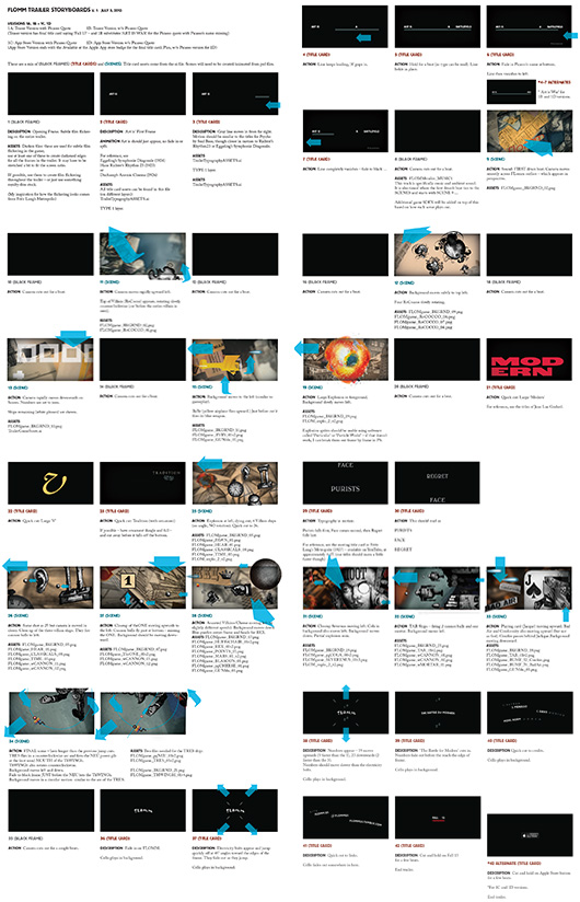
Kevin followed my insanely precise storyboards to the beat and we had the trailer generating hits. Only thing next to do was finish, test and fix and then launch the game.
So we did.
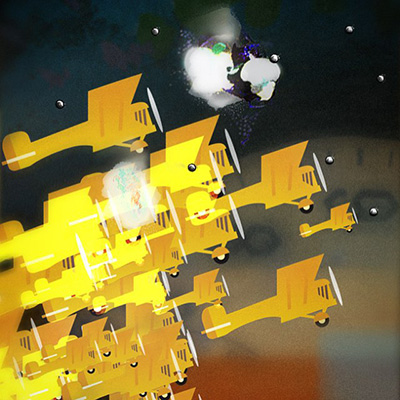
“I blew up and it was beautiful.”
—Teresa Dela Cruz at Typecon
“FLOMM! is the videogame modern artists wish they could’ve made.”
—Jes Joho at Killscreen
“Whether you are a respectable adult who craves Shoot ’em up video games but feels they are below his dignity, or a discriminating teenager that wants to stand out from his peers, Steve Mehallo’s FLomm: The Battle For Modern 1923, a new mobile game that uses the visual language of Modern art and allows you to feel hip and cultured at the same time, is for you.”
—Misha Beletsky at The Typophiles
play flomm!
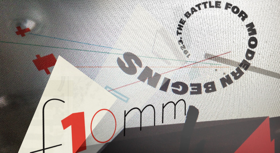
FLOMM! THE BATTLE For MODeRN 1923 launched January 2015 and was well reviewed.
Allison Meier at Hyperallergic, Chris Priestman at PocketGamer, and the legendary graphic design author Steven Heller at Print wrote cool things, among others.
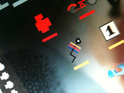

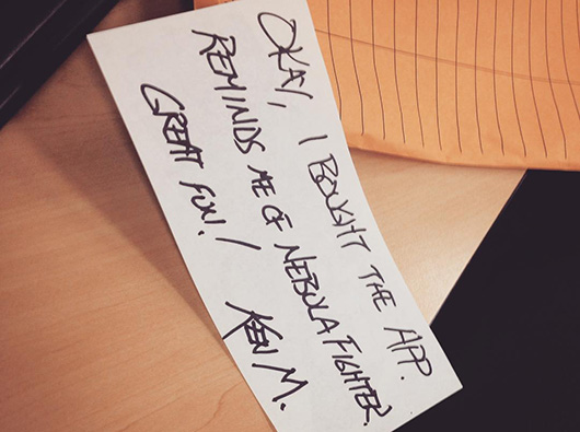
I heard from players I knew (Art History Professor Ken Magri, above) and others obsessed with the game – wanting to kno wat everything was and others following us on social media sent a comment or two – especially our tumblr blog, which also got a visual coding update from Amanda.
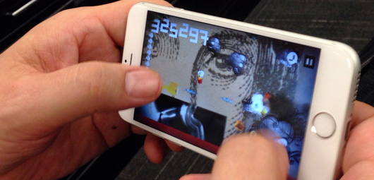
Bill Mead, my boss at school, became the all time champion player (that I knew of) – in that he found it relaxing to just sit and BEAT TRADITION every chance he got (that’s Bill’s fingers, above).
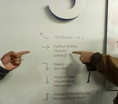
Unity Systems even named a conference room after us. Like, that’s kinda a cool thing.
I was also interviewed about FLOMM! on the longrunning Orange Lounge Radio podcast – where I remember being asked wat the squiggle ships are and wat the backgrounds are.
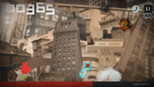
Humans need a universe to understand – a hundred years AFTER abstraction became part of the art world, and Disney explained abstraction in the opening segment of Fantasia (1940) – it’s still a hard geometric pill to swallow.
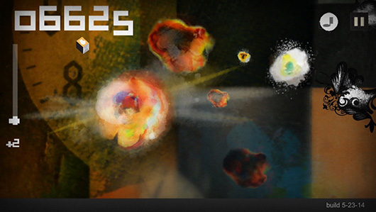
As FLOMM! worked its way thru the gaming market, I found that there’s a lot of people who are still not ready to be flying around in a DADAist environment using an abstract shape as a ship.
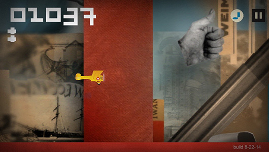
And while this wasn’t obvious at first – it’s something I should have realized by the reactions I get in my history class when I introduce Malevich’s radical Black Square:
People don’t understand Modern Art. People actually AVOID Modern Art. Cause it’s too weird.
Hell, Art Deco is Modern with applied ornament so large audiences were able to get into it.

Even just responses to the floating EAR in my game: Everyone knows there was an artist – Van Gogh or something – who cut off his ear. Which he sort of did, but a bit mor like ear gauges today, not his entire ear.
So common knowledge of Modern Art is: Some guy cut off his ear and Picasso was an asshole that put eyes in the wrong place and Warhol something.
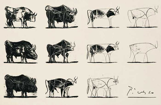
And while viewing all this, I started to change my teaching approach to Modern Art – I now describe something like Picasso’s Bulls (1945) as being similar to applying an Instagram filter to a foto of a Bull. So the final abstraction really is a bull, but the abstraction can be seen as just a filter:
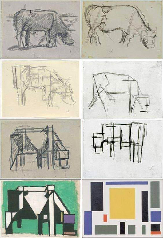
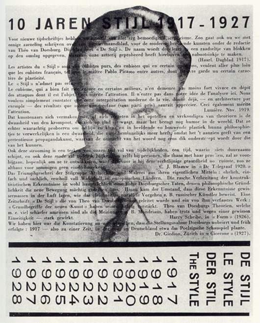
Abstraction makes mor sense when I get into De Stijl. Because Van Doesburg had his own charts to show a painting-by-painting process into abstraction and everything.
Like, Modern Art is a club where if you get it, you’re in.
Like Fashion. Anime. Star Wars, Jazz, Punk Rock, just about everything with a fringe audience. And this would lead me to FLOMM’s next phase.
Because the game itself didn’t do so well.
“Never got your email. But we would have loved to have given you a write up about the game launch if we knew about it at the time. Maybe next version?”
—Managing Editor of a Major Magazine
flomm goes boom!
Well, a few things happened. Emails just either didn’t show up, were caught in filters or were ignored. And I kno a LOT of people who edit design magazines, newspapers, work in television and film, like, everywhere.
But media reaction to the FLOMM! game was mostly a ghost town. Tho I had social media as a backup, right?
Well, in 2015, Facebook just implemented their new algorithm where if you LIKE a page, you no longer easily see wat’s on that page.
The FLOMM game was released in that little gap between them doing that and offering advertising – and we had, like, hundreds of LIKED ppl at this point. I remember a ton of friends who simply never saw the text I sent about the game. Because in the corner, the check box never coloured in (or watever it would do in 2015). Facebook kept me away from SPAMMING friends (as they saw it), so there was really no way to get word out via Facebook, which I sort of counted on.
The way I describe it sounds incoherent, and you know, that’s how I remember it.
Instagram was new (for me) and Twitter was in that no one is really hanging out here anymor space it was in before Trump show’d up.
Real advertising? At the time, my pay as an adjunct professor killed thinking that way really fast.
apple only, are you kidding?
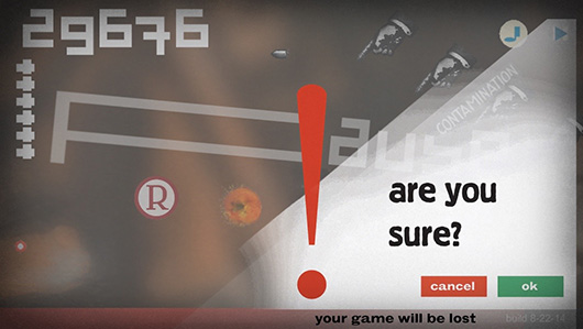
Then this: While Moki planned for FLOMM! THE BATTLE For MODeRN 1923 to be playable across platforms, the final build was only for Apple iOS.
And after the güd reviews but low turnout upon launch, porting it to anything else was not going to happen from my programmer – even though MOST GAMERS are on the Android OS, FLOMM! simply would not be.
Also, we took up a LOT of hard drive space with our backgrounds – large device storage wasn’t standard just yet. I started hearing from people who were simply deleting the game because of the size.
And when iOS went to X – September 2016 – our game broke. Would not play on an Apple device for anyone with iOS X.
It only took 21 months for my history game to become history in the world of gaming.
In my own naïve view, I have fonts developed over 20 years ago that are still downloadable and usable.
This game shit is a totally different beast to me.
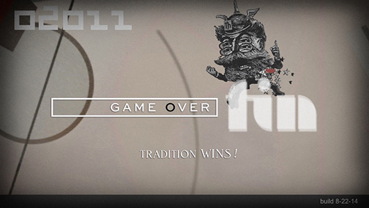
As I write this, I’m talking to nü programmers about version 2. Because just about all the code from version 1 was killed by Unity’s update (which is now really stable compared to wat we used) and Apple’s dedication to planned obsolescence.
Nü killed our game about nü killing old. And the irony is not lost on me.
Today, the FLOMM game is nothing mor than a fucking earphone jack.
“The square is to us what the cross was to the early Christians.”
—Theo van Doesburg, Dutch art movement De Stijl
“Conflict is Universal.”
—Mor from the Manifesto of FLOMM
but
There was another idea from my Graphic Design History class that falls into all this – and it’s sorta covered in MEGGS’ Chapter 15 – but better covered in one of the few English books on the subject, Paul Overy’s De Stijl (1991).
Like FLOMM, De Stijl had a manifesto, backstory, writings, a dude named Mondrian, Theo and all that.
De Stijl didn’t pull punches and wielded the power of the printed word to support and promote Modern Artists at a time when the Modern World was still young.
And De Stijl affected change on a HUGE scale.
And in 2016, the traditions of old, the anger of characters like the ThWINGh and a nationalistic, proud but undereducated population would make fighting nü battles based on things that happened about 100 years ago very, very important.




con
tinue
read
ing —
forward to PART 9 • • •
· · · back to PART 7
—steve mehallo
Flommist Steve Mehallo is a graphic designer, illustrator, font designer, educator, foodie and gadfly. He is the creator and founder of FLOMM!
PLEASE SUPPORT FLOMM
DONATIONS DISCREETLY ACCEPTED


