


Lavender is the Yellow of Japan. Hot Pink is the Navy Blue of India.
So how did dusty rose, suntan and what my friend, Generation X author Douglas Coupland calls “veal” become America’s first palette? The platinum bombshell Mae West is quoted as saying, “I used to be Snow White, but I drifted.” Ladies and gentlemen, we have drifted.
I blame Michael Graves. You gotta blame somebody. To be honest, I’m not really sure, but I do remember seeing pictures of fussy, contrived, overproduced “postmodern” buildings, ornamented with garish aqua architectural doodads. Maybe something tealish or gray-green, stuck wantonly on tops of things in a cheeky fan shape. And then the dirty pinks crept in through unsuspecting doors and innocent windows. At first I thought it was an arty anomaly, but it spread like a cancer. It filtered down, and it’s kept us there too long. Down in the mud.
Okay, so I don’t know who started it, but I do know when. The time: 1983. The place: Raleigh, North Carolina. Best Western? Holiday Inn? Quality, Premiere, Embassy or Something Suites? It suddenly became apparent that while my freckled back was turned, all of the normal colors had been taken away. In their place I found an unholy array of pinkish grays, in every possible mutation. I had been unwillingly introduced to the first family of bastard colors. Grayish maroon. Pale pink gray. Dark pink gray. A Dior lipstick that Polly christened “Vulva.” Have these miscast, misbegotten mixtures been chosen to express the warmth and hospitality of our nation? Really?
I learned their ludicrous hillbilly names. They were “Dusty Rose” and “Heather.” The wall, the trim, the chair, the napkin. The coordinating patterned upholstery, sporting all these bilious hues, sometimes accented with bits of teal. Or veal! Everywhere, bilious salmon-grey placards, warmly thanking us for not smoking. But what if we were? In 1982, you’d better believe it. I see Conrad Hilton, twisting in the wind.
The second group, the detestable Teals had an insidious alliance with the perverted Roses. I saw them everyplace, mixing, contrasting and cavorting, in full view of respectable families: The Greens, The Reds, The Blacks and The Blues. Soon, most things looked like this. I went into a deep depression – perhaps, a brown study – when I discovered that even Prozac was encapsulated in two tones of teal. How about some Off-Red Roses for a Blue-ish Lady?
In a sporting goods store, a wide variety of articles were to be found in Aquamarine with Plum-grey, Greenish-blue with Off-purple. Backpacks in Lilac! Frisbees in Puce! It became suspiciously easy to find teal colored patio furniture and dusky magenta paper plates. There’s a fine line between the exotic and the grotesque. When a baby’s car seat is only available in maroon, eggplant or plum, that line has been crossed with a vengeance. Please Don’t Step on My Heather Suede Shoes. ART TK
But wait, there’s more. Oh, the Sandstone Rose of Texas, Minnesota and Maine! A foray to the West Coast introduced me to the Third family, The Terracottas. This is a large and earthy brood, a Tan Clan, having warm and fuzzy relations with the Adobes. Although they flourish in our cowboy states, they’ve put down their dirty roots everywhere, often accompanying the Teals and the Roses on their architectural journeys. You can see them together down at the mall: a terracotta wall, aqua tables in the cafe, fitted with magenta banquettes. Boneheads. Of course, when used with discernment, a neutral palette has a calming effect. Possibly with an accent in red or black? It is the populist, pervasive and shamefully American combination of aquas, tans, and dirty pinks that offend me.
Call me a hue-ist? I want clean colors from good families! Colors you recognize. “Hello, Yellow! Howdy, Brown! Hola, Blue, How are You? Hey there, Black, Welcome Back!” By 1990 it was Too Late.
The “Tweeds” catalogue had arrived. Remember “Tweeds”? I ordered something in “Pebbles,” but the sixteenth-of-an- inch printed sample couldn’t possibly communicate the dreadful effect when spread out over a size sixteen human female. The effect was totally Bam-Bam. I might have exchanged it for an attractive shirt, but what to choose? Peat? Reflection? Frostbite? Roquefort? Bruise? It wasn’t so much the kooky names, but the fact that these colors were all greyed-out versions of actual colors. They hadn’t just named a blue shirt “Seascape;” it actually was an uncertain, in-between shade, one which you might as well call Seascape, and “Blue” was not available.
In my own work as a designer, I have suffered the slings and arrows of the prevailing taste. An identity I designed, using Red (PMS 032) and Blue (PMS 285) was rejected, on the ground that these were not sophisticated colors. One client queried, “Why can’t you use, like, yellow and gray?” My response? “Well, I could, but then I’d have to, like, shoot me.”
Most of the time, I live in New York, where, when colors are dirty it’s because they are covered in actual dirt. The rest of the time I live in Sweden, where colors like red, yellow, blue and green can still be found in all their unblended purity. Of course, Scandinavia is famous for its brightly colored textiles, but they still permit “regular” colors in parts of Europe and Asia, I believe. I’m not saying all colors have to be bright, but they should be at least classifiable. Michael Pollan says not to eat anything your grandmother wouldn’t recognize as food. I say steer well clear of any color that cannot be immediately identified as such.
In a parallel story, in Italy, one can order a piece of fruit for dessert. A nice peach, or something. On a plate. Or strawberries and cream! Or without cream! At a real French restaurant in France, you can get a piece of meat and some potatoes, without nasturtiums, cardoon, or pistachio foam on it. But what meat! What potatoes! Not that it’s relevant, but I often give meat as a gift. I always box and wrap it up beautifully. A bloody filet mignon or two makes a fabulous birthday present. In America, we cannot leave well enough alone. In everything from soup plates to nutcrackers, the place I notice the yucky colors most is here: the real, non-New York America, the America I know nothing about and upon which I have no right to pass judgement.
I see them in floor tile, fabric, those evil, ubiquitous, stacking plastic chairs. Those things should be outlawed. In the hideous streamlined running shoes, molded plastic bike helmets, complicated toothbrushes that look like running shoes, boats and cars that look like running shoes. The seats at the movie theater. But what the hell, us New Yorkers are a snotty, judgmental lot, and besides, nobody asked My Permission to take the real colors away. I’m not tickled heliotrope. I’d like to get a glossy, opaque, non-metallic, cobalt blue car. I can’t even find a green sweater. Really! Somebody find me an emerald green sweater. Finger paint green. Please, do not mention your vintage green Comme des Garcons sweater with an on-purpose hole in it that you wore to Art Basel Miami that you bought on eBay for only 2400 bucks. This does not count as clothing. It is Fashion. Actual people can’t and won’t ‑nor should they- tolerate this kind of thing. Disqualified, I say!
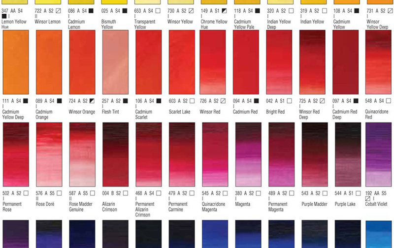
Normal colors have associations. Meanings. Some subjective connotations might include: Purple: Hippie, New Age, Goofy Grape, Oregon. The seventies. Navy: Conservatives, and, of course, the Navy. France. Big Business. Red: Positive, Communism, Blood, Tomatoes. Fire Truck. Green: Ecology, Grass. Money. Eco Marketing. Gray: Age, Concrete, Industrial, Boredom, Rain, Minimalism, Dust. Orange: Designiness, Gayness, Hipness, The Sixties. Holland. Oranges! Pink: Little Girls, Barbie. Cupcake frosting. Bubblegum. Cancer?
None of these are too far-fetched, are they? In product design, there are some notable exceptions. I love those white Macs. Unapologetically snowy. But the Hewlett Packard printer is … uh, veal color. Sick! In recent years, most electronics products opt for a titanium finish, avoiding the color question altogether. Wussies. Of course, if you’re collecting original Eames, and shopping at Vitra, there’s nary a mauve in sight. Yes, Ikea is one affordable place. But even they have given in to beige, a bit. And If Marc Newsom designed your car, it’s probably a fantastically legitimate color. I just don’t know anybody who has one.
Pantone had nothing to do with this. They just call ’em, they don’t pick ’em. Li Edelkoort had nothing to do with this. A professional trend spotter, she predicts for multinational corporations which colors are cool now and therefore sell to the unwashed masses in the future. She asks her hipster friends, “What color do you like?” and they say, “Oh, something like tomato soup.” And suddenly there’s a shiny new tomato soup colored Ford Explorer in your garage. Of course you had nothing to do with this, dear reader. But if you do, please come forward and declare yourself, traitor, so that we can dunk you in a pinkish sauce.
For all I know, these heinous new hues are the grassroots favorites of every American, and rightfully deserve their de facto status as our true family values. Perhaps we should rethink the flag.
Three cheers for the Rose, Veal and Teal!
—laurie rosenwald
Flommist Laurie Rosenwald is an American illustrator, author, artist, and designer. Copyright © 2019 Laurie Rosenwald.
MOR D’ARTÍCULOS MOR FLOMM !
READ SOME RELATED DER TUNG POSTS :


PLEASE SUPPORT FLOMM
DONATIONS DISCREETLY ACCEPTED