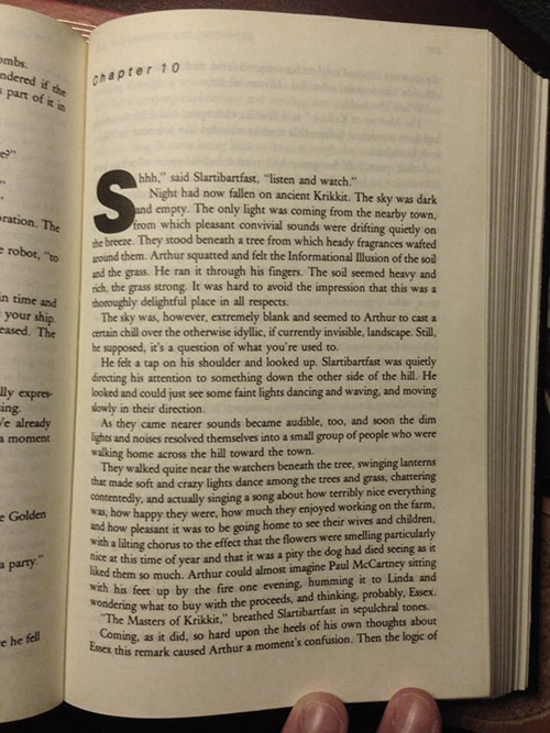
S’hhh?
S’and?
S’from?
Drop Cap issues.
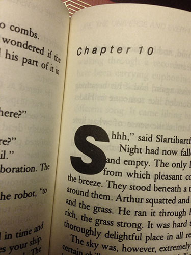
I nearly dropped the book when I saw this.
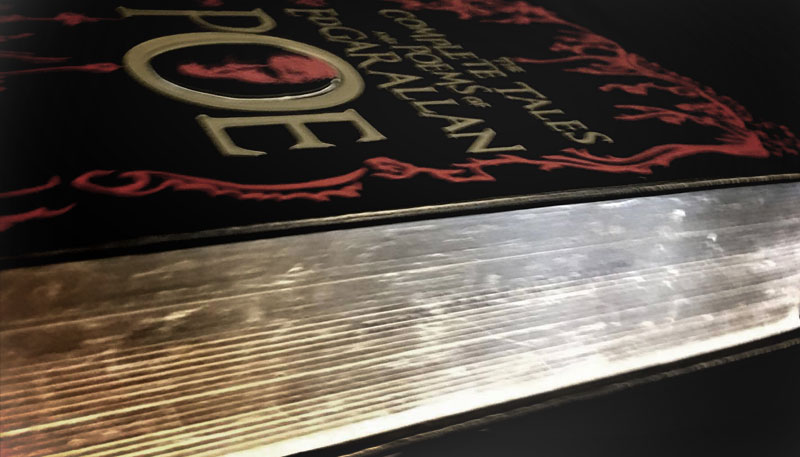
The Barnes & Noble Collectible Editions have lovely covers and ugly typesetting issues.
I own three.
I may return one. I’m torn. This may be a deal breaker.
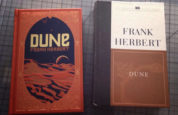
They appear to be repackaged copies of CML (Classics of Modern Literature) books with more ornate covers for special markets.
Standard CML’s are cheap (around $2–5). The typesetting between both volumes are identical across multiple titles. Essentially, you’re paying for a fancy textbook.
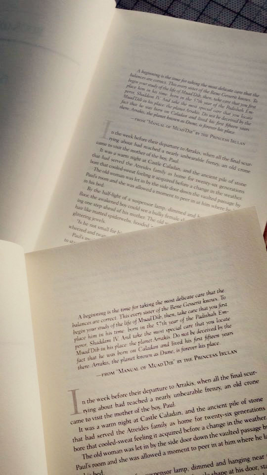
As for the typesetting within, we’re talking year one graphic design student type; it’s a rush job that looks like glorified placeholder text.
Drop Caps are not adjusted and grids are improvised. The margins are claustrophobic.
That being said, the covers are still impressive and the gold leafing is gorgeous. Notable illustrators and designers made the covers and forward matter.
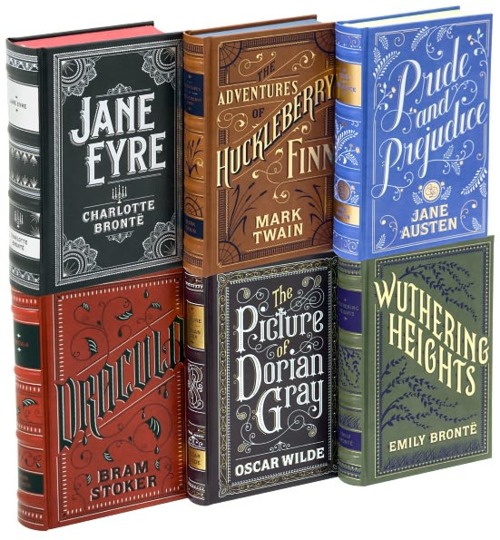
Though fair warning: The color on the covers rub off during shelf wear. Let these volumes ‘breathe’ on your shelf if you can.
Extra points for honoring the tradition of Illustrated Manuscripts though.
But all said, after perusing through several, Barnes & Noble Collectible Editions are a solid B-. Was hoping for the craft inside to match the outerwear.
—louis hernandez
Flommist Louis Herdandez is obsessed with going Bauhaus and becoming The Machine. Preferably a drill press. Copyright © 2017 Louis Hernandez. Bottom image source.
PLEASE SUPPORT FLOMM
DONATIONS DISCREETLY ACCEPTED


