“Orzechowski modeled his lettering on the Flash Gordon newspaper strips of the 1930s. Another influence was Robert Crumb’s Zap Comix: Orzechowski recognized that Crumb’s title work was clearly derived from the brush techniques of that same era, the 1920s and 30s.” —Wiki
With a revisit to 1977 happening this week with the release of ROGUE ONE, I decided to go through some of my stacks of books and take another look at some of my Star Wars comics – which were the ONLY story-related tie ins we had back in the day. Comic books available at small drug stores – or cigar shops – handdrawn interpretations of what the movie was supposed to look like, with interpretative lettering.
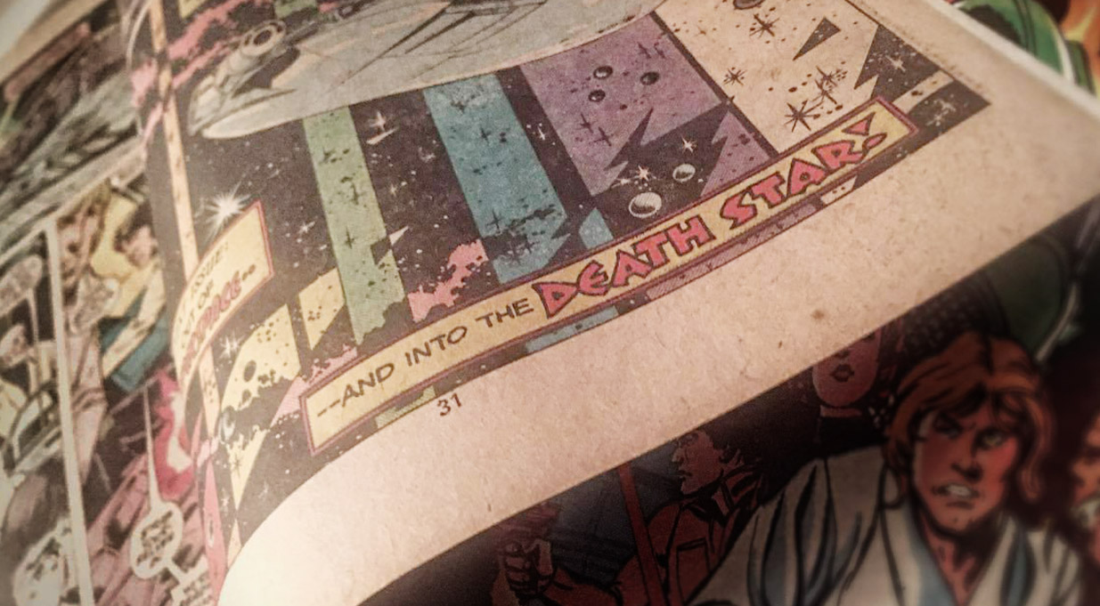
One of the first times I really became aware of hand lettering in comic books came with Marvel Comics’ 1977 Star Wars movie adaptation. From issue #2 thru #5, the lettering had this smooth, compact quality to it. With cool titles up top.
Behind the scenes was lettering artist Tom Orzechowski — working for the Mighty Marvel Bullpen.

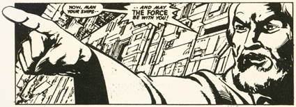
1977 Star Wars panels with lettering by Orzechowski. Marvel’s adaptation of the first Star Wars film was printed and reprinted many times; these black and white shots come from a small pocket-book-sized edition
Over the years I would fall in love with lettering work done by ‘Orz’ – the shortened version of his name appeared in many credit boxes. One of the unsung industry greats, his brush work has graced the pages of numerous comics, and gave voice to the now vintage Uncanny X‑Men works of the 70s and 80s – and later, Todd McFarlane’s Spawn.
star wars manga
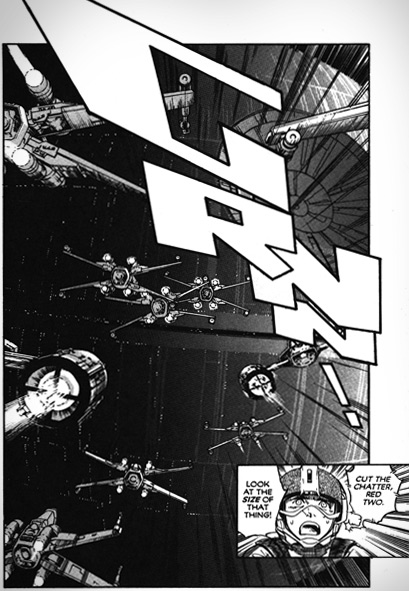
Back in 1998, I ran across translated editions of Hisao Tamaki’s manga version of Star Wars.
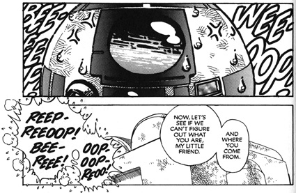
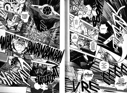
1998 Star Wars manga panels, translation published by Dark Horse Comics
There are a few problems that pop up when adapting a manga comic for Western eyes. The first involves the flow of the art; taking right-to-left (the Japanese standard) and adapting it for left-to-right.
Some publishers just avoid this – and write a nice intro explaining things. Others will ‘flop’ the images ‘mirror-like’ and hope it doesn’t cause too many problems.
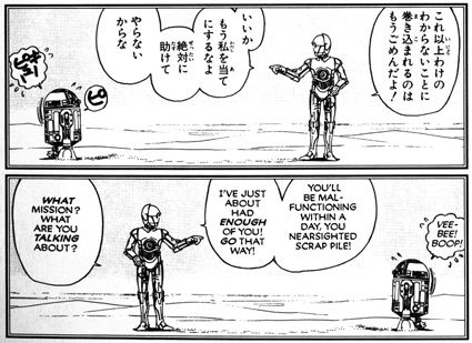
When it comes to text, typically publishers will go halfway, substituting computer fonts for Japanese text – sometimes simply using Helvetica for dialogue.
Since traditional manga also uses more than one language to tell a story, sound FX are a whole other issue. The FX are a huge part of manga. But they basically don’t translate well into English. Not in the dramatic sense that is the artist’s intent.
Unless Orz gets his hands on them.

tie fighters go shreeeeeeeeeeeeeee!
According to Orz, who recently found FLOMM and me on Facebook, “The Japanese SFX were still part of the art I received. It was my job to compose the English sound effects in such a way as to completely cover the Japanese versions.
“They weren’t included in the script; I was on my own for that part of the job. If they sometimes read a little oddly, that was the reason. Also, due to the deadlines, I could spend no more than 90 minutes per page – it was about a book a month and I’ve lost track of how many months the project lasted).
“I was using India ink and/or Pelikan White to cover over the Japanese effects, which were still on the photostats. At the same time, I was making up the sound effects to more or less match the shape of the Kanji and Katakana forms. Big fun, in a Zen sort of way. That speed of production led to an energetic look to the effects, I have no doubt.”
So – in a jump back to my childhood – I found myself once again reading a Star Wars comic with Orzechowski lettering.
But in the time that passed, not only did Hisao Tamaki take Star Wars to a whole new place, Orz lettered and retouched everything – including the FX – into an incredible tale of sight and sound.
Wish all manga could cross the ocean the same way.
(Orz did do other multiple manga reworks for now-defunct Studio Proteus, a list of titles can be found on their Wiki page.)
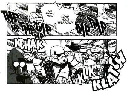
state of comic book lettering
Over time, comic books have found digital fonts quicker and cheaper than using traditional ‘letterers.’ Digital fonts have jumped in where brushwork and pens used to tread. And in my opinion, classic Marvel Comics featured some of the best lettering ever attempted – and this ‘look’ is still part of the current MARVEL logo:

But today, with handlettering once again appreciated as an art form, Tom Orzechowski is still doing his thing:
“This is the crazy time of the year for me, work-wise. In the next four weeks I’ll be doing the second issue of Wonder Woman ’77 meets the Bionic Woman; maybe 40 pages of a video game history book; a 56 page humor album called Sea Creatures; a new issue of Tales from the Crypt; Spawn; and a 28 page webcomic called Zana (eMet Comics).
“Oh, and a couple of logos too.”
Here’s an interview. And another one.
And to get hooked on these now-vintage mangas, start here.
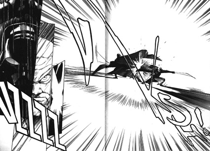
Vader-n-Ben duke it out
—steve mehallo
Flommist Steve Mehallo is a graphic designer, illustrator, font designer, educator, foodie and gadfly. He is the creator and founder of FLOMM!
PLEASE SUPPORT FLOMM
DONATIONS DISCREETLY ACCEPTED
