Several years ago I came up with this idea:
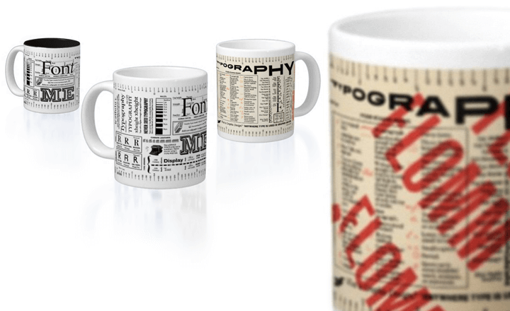
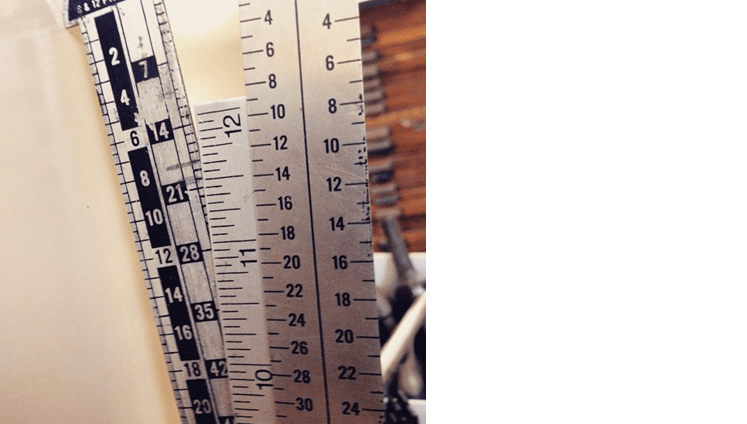
Why not put a professional type gauge (with pica/point/inch) on a coffee mug?
Graphic designers, typesetters, and printers have used some form of these over the years. Extremely helpful, vintage, industrial ephemera.
I added in proofreader marks (from a 19th century business manual),
historical font measurements,
type classifications,
typesetting rules,
and (most important for anyone working with graphic design/desktop publishing/page layout software)
decimal inch conversions –
since a big chunk of graphic design/advertising workers still use inches for measurement. (When working as a production artist, I used to carry a decimal conversion chart with me; so, why not put it on a mug?)
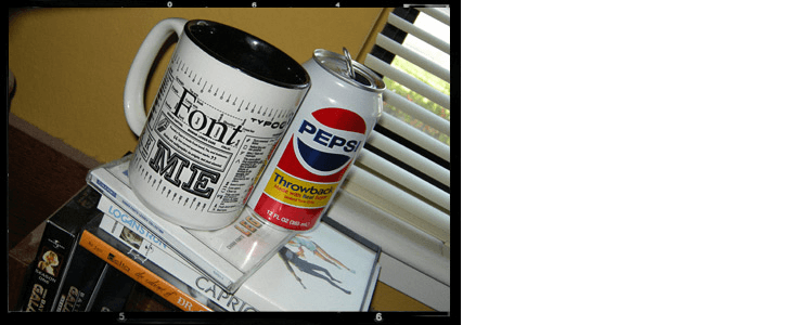
My FONT ME mug (above) hit the Zazzle market in 2009 and it sort of went viral.
Graphic designers love ’em.
I sell a lot of them.
Just sold a few more last week.
And my students – after graduation – would get them for their desks.
One commented, “You should have had this mug as your required text.”

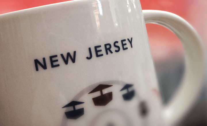
Tho personally, I kept using my EXTRA-LARGE Starbucks City Mug for coffee. Because bigger.
And I was never really happy that I couldn’t fit everything I wanted to in the small FONT ME space.
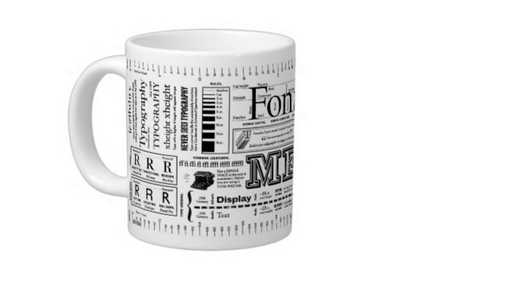
making it big: introducing extra-large font me
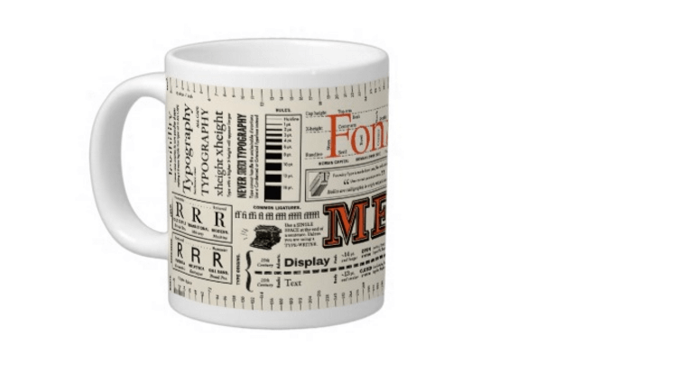
This year Zazzle not only has improved their imaging process, they now have EXTRA-LARGE Starbucks City Mug-size cups available.
So I spent last weekend pulling out my old notes, going through old typography books and ephemera, and figuring out what else should go on an UPDATED EDITION of this mug.
Since 2003, I’ve been teaching some sort of BEGINNING to INTERMEDIATE to ADVANCED Typography course. And in the last few years, I’ve been using a lot of new concepts to describe What Makes Typography Good.
So I’ve adapted infographic pieces of my lecture/discussion materials to fill the extra space – including the historical difference between DISPLAY and TEXT type, things NOT to do with TYPE, word shapes and probably the most important thing that sort of just spouted from my mouth one day:
‘Anywhere type is used is graphic design.’
~ because so many people think graphic designers are computer programmers, logo makers and goofy artists. We’re not. Graphic design is a communication field. And typography is our most powerful tool.
AND if you are a GRAPHIC DESIGNER, this sentence on this mug can be pointed out to ANYONE in your office who doesn’t know exactly what it is you do.
Which brings me to the easiest way to get your hands on one of these mugs:
If you’re a graphic or web designer, editor, or work with fonts in any way, ask someone who buys you gifts this time of year to get one of these mugs for you.
Secret Santa, estranged family member, who owes you a gift? And who really doesn’t know what to buy for you?
「 Here’s a link 」
And here’s an easy-to-remember URL: flomm.us/FONTme
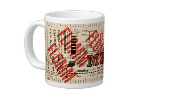
FONT ME mugs are now available in 4 versions: Original Two-Tone, ExtraBold, and as TWO FLOMM variants; cause I do FLOMM now. And personally, I’m snagging the FLommwoorde Edition cause my Starbucks City Mug vanished in a move years ago.
Kind of pricey? It’s just a bit more than the original AND Zazzle runs sales. A lot. As I write this, mugs are 20% off. Always look for the code at the top of the page. And we have other extra-large FLOMM mugs too.
Drink and be merry! And note that this is one of the few FLOMM things that is actually Safe for Dishwasher and SFW.

—steve mehallo
Flommist Steve Mehallo is a graphic designer, illustrator, font designer, educator, foodie and gadfly. He is the creator and founder of FLOMM!
PLEASE SUPPORT FLOMM
DONATIONS DISCREETLY ACCEPTED


