‘Well, I met with the student, he has a long list of things. Wrote a lot down.’
The department chair called me in. On his desk is a paper clipped pile of notes in a manilla folder. Manilla folders are serious. I’ll Decide What Homework I’ll Do was in to complain.
‘I don’t think it’s anything to worry about. He started with you didn’t have a syllabus and then had a long list of things. Doesn’t like what you’re teaching at all. Wants to concentrate on something else, really hates history. His biggest complaint is that he saw his midterm grade and it’s an F. And he thought he had an A.’
‘An A -? He hasn’t done most of the work!’ Big flaw in my teaching technique: If students don’t do the assigned work they don’t learn anything, and I have nothing to grade.
The chair continues, ‘He is very organized in his notetaking …’ he reads thru, flipping pages. ‘He’d also would like a few of the students removed from the classroom. A girl in there was rude to him – absolutely no respect for him or his work – so he wants her gone. Another he feels just doesn’t have the talent to be a designer. Should be gone.’
Getting used to my jaw to dropping on the floor is a big part of my job. I have a signed syllabus legalesus from every student. And I haven’t seen a rude person in this class – well, beyond this student. I can be interpreted as rude, I’m the teacher. Trick is to be blunt, but stop at that. Then any interpretations are on the student. And I talk about problems as I see them, i.e. my conversation with Star Wars last session.
The chair’s conclusion, ‘I reminded him that he’s in college and there was a syllabus, I showed him my own copy right here.’
Organized chair.
‘And removing other students from the classroom is not something we do. I asked him to talk to you about the grades. And see what you can work out. We’re seven classes in: This is about the time that our invincible students start to realize they may not be as invincible as they thought they were. See what you can do.’
Well, things are getting interesting.
back to class
‘We all have a different take on the assignment and this is awesome!’
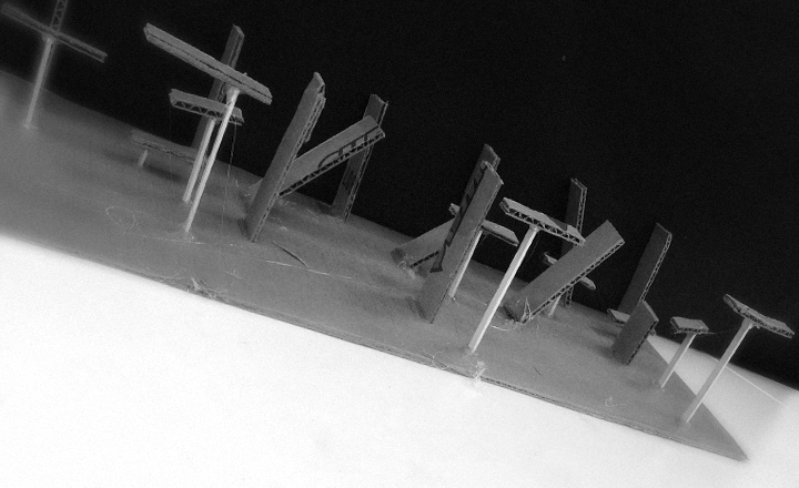
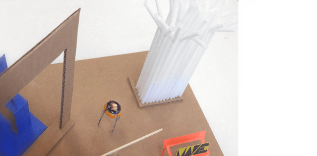
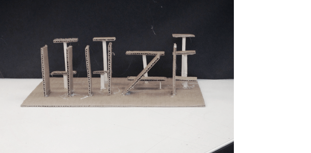
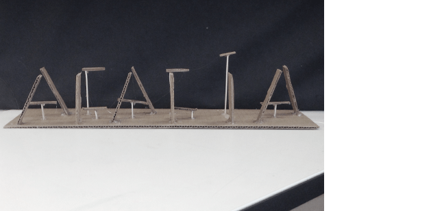
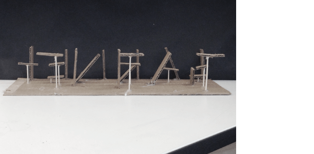
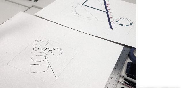
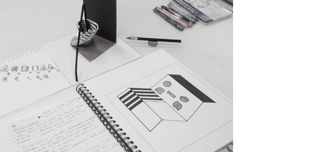
Homework was to create a Moholy-Nagy-inspired CONSTRUCT incorporating typography (while looking at the geometry of letterforms).
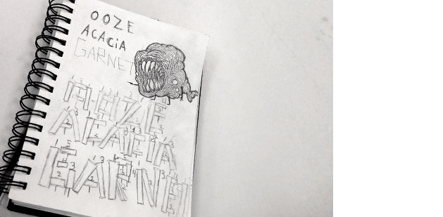
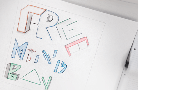
These kids pick some interesting words: OOZE, ACACIA, GARNET, among others. Above, lines and planes as a 3D corrugated cardboard recreation of capital letterforms. The student spent a long time planning and structuring these sculptures. His notes:
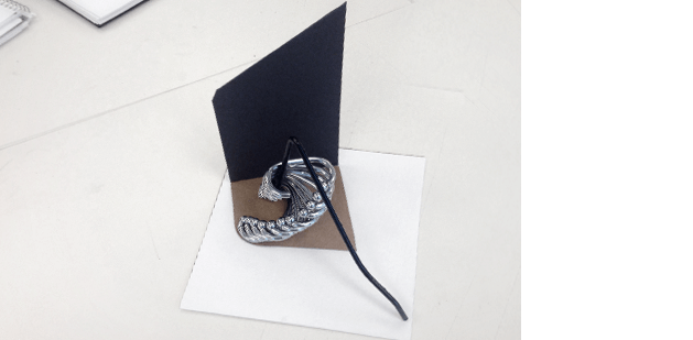
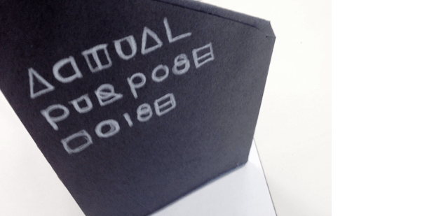
Waldorf’s work is simple, interesting – but she’s fallen into a trap I’ve seen with a lot of artists: Where do I put the typography?
In her case, she’s snuck it onto the back of her form, just stacked. There. No real integration.
I mention that I see this a lot. Somehow type becomes this thing that is often seen as an extra, an add on. Like the 1970s album covers where they just threw the type in the corner, up top. And that’s that.
I start talking about design trends. Since Waldorf is a fashion marketing major, I mention how trends are tied to seasons in the fashion industry. I also mention graphic design’s unofficial seasons used to be around three years, organized by decade – though with social media, trends are distilling down to one year or so.
How do trends start? It’s a loaded question – with no simple answer. Somebody does something cool, others see it and a lot of copying goes on. And it works its way through the population.
My favorite example of this is explained in the cerulean blue sweater scene from Devil Wears Prada (2006):
(With a nice counter here – showing that trends really can come from anywhere)
I add that I think good designers watch trends religiously just to see what is going on around them – and as a student one should watch EVERYTHING.
So I have to ask the pointed question, ‘Why do I end up with so many students who just don’t look at other people’s work? They just start projects and don’t pay attention to anything else out there?’
There’s no straight reply. Jealousy comes up – which I do end up bringing in my own take on being jealous: ‘Every time I’ve ever acted on jealousy, It’s blown up in my face. So I don’t do it. And I’ve gone so far to remove it from my life, to the point I often don’t see it in others when it is going on.’
(spite, however, is a whole other thing)
We talk a bit. I reveal, ‘Ever date someone who’s cheating on you – and it turns out that you’re the one she’s cheating with on someone else? Something like that is a big enough mind fuck – only thing one can do is learn to not be jealous.’
Turn jealousy into inspiration. Aim for someone positive. So there’s no downward spiral.
Sites to constantly monitor: Pinterest, for fashion Lookbook, and Behance. ’Cause that’s where you’ll see what you’re really up against.
Back on topic:
If type can be interpreted as geometry, it becomes its own form. Might as well use it in your work as such. Not just as an add on.
Some really interesting forms here, even though the student has returned to stacking his work; playing it safe. We talk about how he has to work on getting past this.
I throw in some talk about how type is read (from my beginning type classes) – type is shapes, and when put together, words are read as a whole:
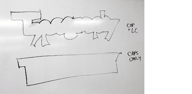
(and note that lowercase reads faster than all caps – even though the letters are not there.)
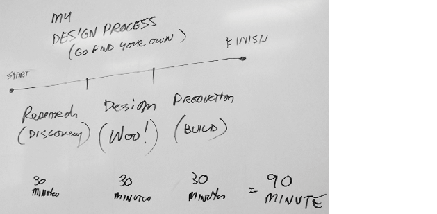
While I’m at it, I give them a little bit more of my own design process – based on a three pronged approach:
Which I note can be broken into 90 minutes, because …
one more challenge!
‘Please hand off your homework to the person sitting on your RIGHT. You have 90 minutes to redesign your classmate’s homework. Please render it as an 8x8 inch square. Break out your tasks into 30 minute chunks, similar to the process chart.
‘And if your new interpretation looks too much like their piece – you haven’t gone far enough.’
To push them a bit more – I assign each of them a Bauhaus master to research and draw inspiration from (based on elements I see in their homework). They include:
(and yes, we have three absent today. Including Star Wars and I’ll Decide What Homework. Not happy about this at all, because we’ve covered even more territory in this morning’s discussion.)
Mood music:
FLOMMISCHEN número 53
« avant shoes à san francisco »
25 tracks [1hr 31 min]
90 minutes later
New forms do emerge. And this sudden jump into timed work (again) does throw them.
Waldorf is stuck. Herbert Bayer can be overwhelming, though we discover the 30/30/30 time management thing didn’t quite happen.
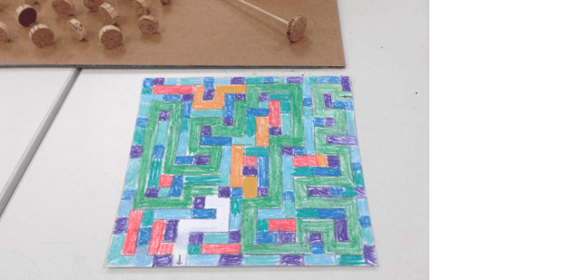
Elsewhere, work inspired by a corn maze results in a Gunta Stolzl-inspired study. Me calling ‘Time!’ at the 90 minute mark results in a nice unfinished WHITE section in the piece – very powerful – reminds me a bit of the work of flommist Mark Emerson.
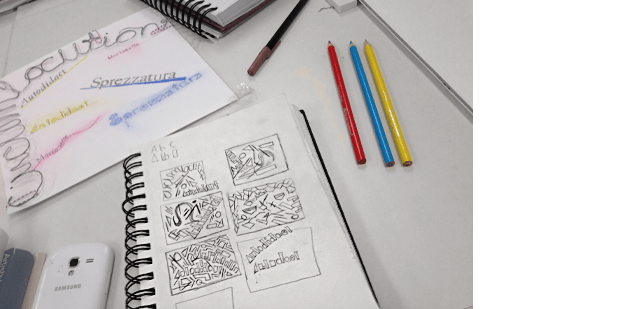
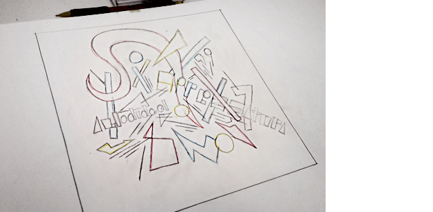
And over at the far end of the room, THUMBNAIL sketches propel a circumlocution piece into something totally new, abstract:
We talk about the power of THUMBNAILS, idea generation, form, layout, experimentation, abstraction …

De Stijl by Paul Overy
Thames & Hudson, ©1991, ISBN 978–0500202401
de stijl
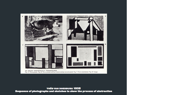
And move into the influence a small design movement from Holland ended up having on the Bauhaus, modernism and the world (check out the book above for a quick read). De Stijl was run by one guy – a skilled propagandist named Theo van Doesburg – armed with a magazine and a big mouth.
I go over how abstraction was explained in De Stijl magazine – and how members would criticize elements if they weren’t abstract enough.
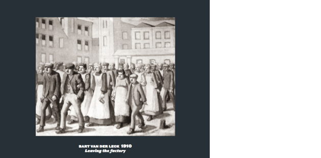
Below, Bart van der Leck abstracts Leaving the Factory 1910 into Composition 3, 1917
And I mention what Piet Mondrian’s work looked like before his contact with De Stijl:
And after:
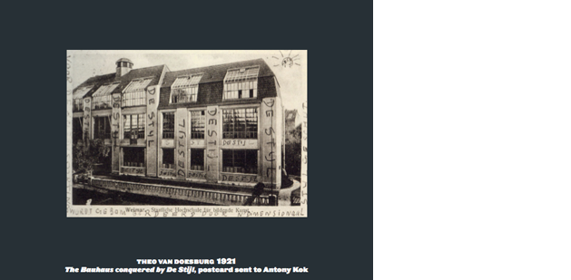
And I talk about Van Doesburg showing up on the doorstep of the Bauhaus – angry that no staff member was Dutch– and how he ended up tutoring students nearby …
And how this happened at time when the Bauhaus was moving away from being a medieval crafts school into a fully-fledged institute for design …
… I go on to cover Bauhaus history up to 1933, when German chancellor Adolph Hitler comes to power and very quickly decides to shut the school. Then no more Bauhaus, no more non-Germanic lowercase typography (sorta), no more modernism. If only Max Rothman had had his way …

Iwao Yamawaki, The Attack on the Bauhaus, 1932
Homework:
I introduce the two major projects that will be due as part of the final – in class 11:
9 Bauhaus PLAYLIST STUDIES
Develop 9 squares. Each square should reflect a different genre of music. What are you listening to while working?
9 Bauhaus MASTERS STUDIES
Develop 9 squares. Each square should represent a different Bauhaus master. For a list, hit up wiki.
FOR BOTH PROJECTS, each square should represent what you’ve learned from each reading.
9 readings = 9 squares x 2 projects = 18, total squares due on the final
Start sketching!

Plus, for next class:
Mies van der Rohe FORM ASSIGNMENT
In one square, interpret the phrase ‘Less is more’ from Ludwig Mies van der Rohe (1886–1969).
And, READ Design Basics Chapter 11, pages 230–241
—steve mehallo
Last year, FLOMM founder Steve Mehallo rebuilt a design fundamentals course into a five week study of theories and work done at The Bauhaus (1919–33). This BAU blog series will document the latest teaching of the course – with lesson plan – Summer 2015 to a group of 8 college students. What’ll happen, who’ll shine, who’ll drop. Names (and some situations) have been changed to protect the innocent as well as the guilty.
co
nti
nue
read
ing —
forward to BAU9 • • •
· · · back to BAU7
PLEASE SUPPORT FLOMM
DONATIONS DISCREETLY ACCEPTED


