‘You’ve fucked up my whole life and now I’m seeing fucking planes and points everywhere. I’m observing everything, analyzing everything. In my apartment, other people, students, photographs …’
We look at the can of tea – and as a class we break apart the composition, the planes in the large logo – we talk about the hierarchy, where the name of the product is placed – and how the nutritional information is downplayed on back. All considerations of a graphic designer.
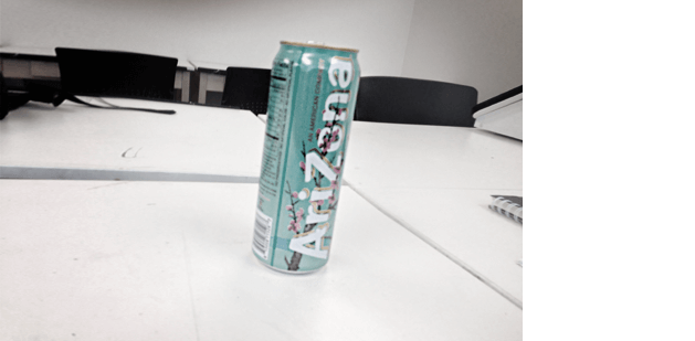
‘As far as I’m concerned, there no tea in that tea. It’s an American approach to food: Give you a flavor you’ll like and load it up with high fructose corn syrup,’ I comment. ’Cause I’m starting to think about the FLommist Manifesto of Food and what it would contain. ‘If you want real tea, start with a tea bag and some water. Doesn’t taste a THING like what’s in that can.’
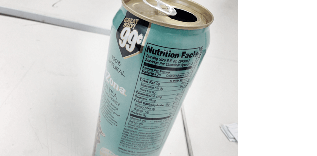
(and as collateral to this, the class is writing down my reference to The Futurist Cookbook; which can lead to some fun culinary shenanigans)
summing up
Only three classes left and the students who are getting it are getting it. They’re talking about how they’re seeing what we’re learning – and how it could be used. We talk a lot about application of images to structures and the materials that are covered in the readings, go over some of the stuff one should expect once they end up working in a creative field.
I note that typically a class like this focuses on the techniques covered in the textbook, but in this case we’re working around the text content. The text is supplemented by our Bauhaus studies and it should all come together in the final projects.
collaboration
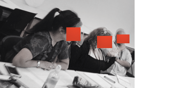
Another discussion topic this morning is the importance of collaboration between friends, peers, other students and other designers.
‘Two brains are better than one,’ a comment from one of my former students, John Slingerland, design director at Digital Gear. A few weeks back, he gave a talk to a local web design club.
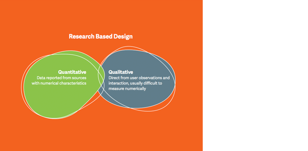
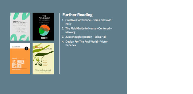
John explained techniques for working with creatives, adapting a project to fit actual audience needs thru comprehensive, even unusual research. I share a lot of this sort of thinking with beginning students so the ideas sit dormant, until really needed – in later classes and on the job. Note the three-pronged approach is similar to what I presented in the last class. A few of John’s slides:
Good design is not a solitary process. It should involve other individuals. Collaboration can go pretty damn far.
‘I always learn from other artists – me and my friends work together …’ explains Bad Chicken, whose class notebook is bursting with images. ‘So all this stuff I’m learning here I’m sharing with others. We come from humble backgrounds, so we just play off each other and learn from each other. Very much like what we’re learning from the Bauhaus.’
I mention the concept of GROUP WORK being feared in education – whereas it really sets students up to do cool stuff beyond their own little personal bubbles; but typically what happens is one student does the work for the whole group (tho, that’s the student one wants to hire – and put them in a team that actually works together).
Hell, even when Project Runway does TEAMS everyone freaks out. More than one person working on something results in better work, and this is another thing I want to do today.
‘less is more’
The students are now used to researching Bauhaus masters, they mention that the different personalities had different takes on the material, but pretty much all spoke the same visual language.
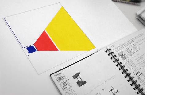
We look at the Ludwig Mies van der Rohe homework and discuss what’s working, what isn’t. We talk about hierarchy, what one sees first, second, third.
I give an example where students talk over each other to show that people, on the whole, can only focus on one thing at a time = hierarchy.
It’s a simple example I use a lot: Just have most of the students start talking about something – all at the same time – then have the ones left try to make sense of it all.
‘So what are they saying?’
‘I have no idea. It’s all a garbled mess.’
It’s our world. And we’re not evolved enough to take in everything; so we edit out what we perceive as garbage.
Here’s another version of the visual stimuli we have to deal with every day, highlighting just the TYPOGRAPHY around us:
Studio Smack, Kapitaal, 2006
Today it’s very important that designers know how to command what they’re putting together. Well-designed visuals can allow us to move thru the world around us without getting confused. Using POINT LINE PLANE for good, not bad.
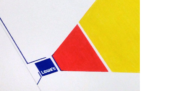
Back to the primary colour piece: We note where one’s eye is drawn based on the placement of elements. And I mention, in practice, that’s where a graphic designer would put the call-to-action, or the logo. Like this:
(Placed low, cause that’s what Tschichold would have done)
(And I wish Lowe’s had a logo that would just settle on ONE font, not a mix of letters that don’t go together)
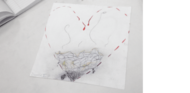
More illustration. Even nine classes in, for some, abstraction is still a very scary thing to do.
And this question comes up (because we’re adults), ‘What’s with the pubes?’
‘I don’t know how to draw burning coal!’
I remind again, you don’t need to know how to draw for this class. All you need to be able to make is geometric shapes.
Of course this leads to a discussion of SEX in advertising. Because this is one of the THREE THINGS I’ve been told one should NOT discuss in a classroom. The other two are POLITICS and RELIGION. Tho all three always show up in my classes. And ONE can discuss them in an academic sense; that is until political correctness kicks in; which has happened to me a few times. Especially if one tangles humor with history.
Yes, SEX can be a compositional element. Because humans respond to it. We wouldn’t have a population if we didn’t. I mention the first ever overt SEX-based television ad (that I remember) in the U.S. It stood out amongst the rest:
Jean Naté After Bath Splash Commercial, late 1970s
Once the Genie was out of the bottle (or body wash squirted out of the cap) (or diet cola out of the can), there was no putting it back.
And the less said, the easier it is to get into the minds of the audience and let them draw their own conclusions. ‘Less actually IS more.’

Mies van der Rohe, 860–880 North Lake Shore Drive Apartments, Chicago, 1949–51
Back to Mies – who is pretty much the reason our skyscrapers look the way they do (the prototypes, above) – I ask if they could do their pieces over, how much could they take out and still make ’em work?
dood
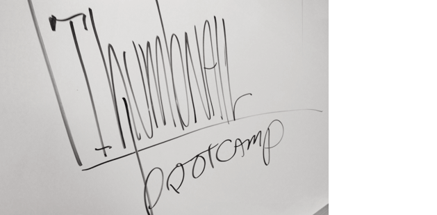
Then I ask about THUMBNAIL sketches.
‘I didn’t do any of that. Because it’s so new to me!’ says I Don’t Draw. This class, for her, is becoming a reiteration of her earlier practices, heels dug in. She WON’T draw.
My nice response to this is: ‘This entire CLASS should be new to you … Can you, at least, draw circles, lines and geometric shapes?’
So THUMBNAILS.
Every time I mention it in an academic setting, students WHINE. Even in my advanced classes. They start moaning about how much they don’t like doing them. Which is always a problem, ’cause they’re one of the best ways to develop new ideas (reference the Doc Brown speech from BAU6).
So I say, let’s call ’em SKETCHES. And they seem okay with that – but I take it farther:
‘If you don’t like that word, we can candy coat it even farther – let’s call them DOODLES.
‘You can DOODLE, can’t you? Doesn’t everyone DOODLE? Can’t believe I have a bunch of recruits who can’t DOODLE. Your mommies aren’t here to show you how to DOODLE. We’re now going to DOODLE!’
I talk with marbles in my mouth. Because bootcamp. And I’m the sergeant.
I remind them humans are great at this change the word shit. In fact, ‘Did you notice we don’t have TOILET PAPER anymore? We don’t. Go look for it. All you’ll find is BATHROOM TISSUE.’
‘And Angel Soft is not soft. We live in a world of lies and deceit.’
thumbnail bootcamp
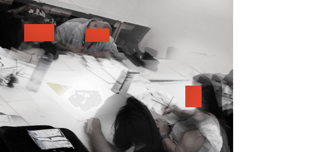
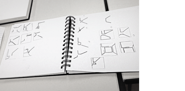
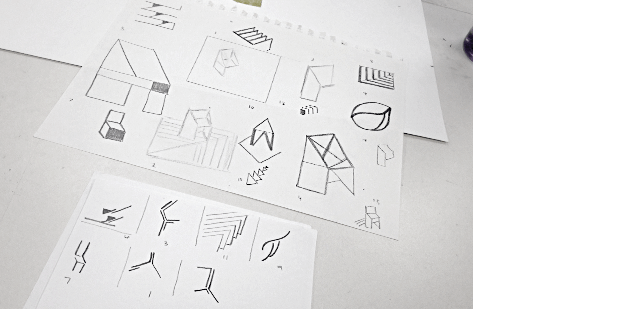
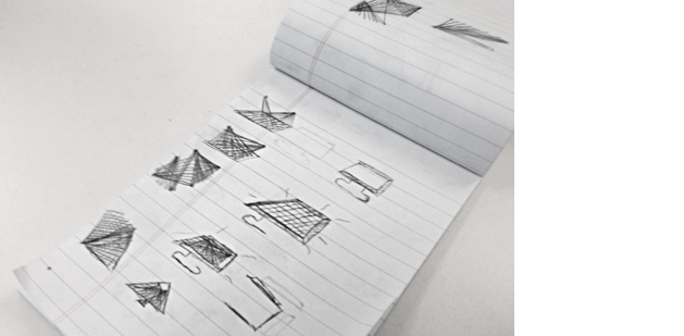
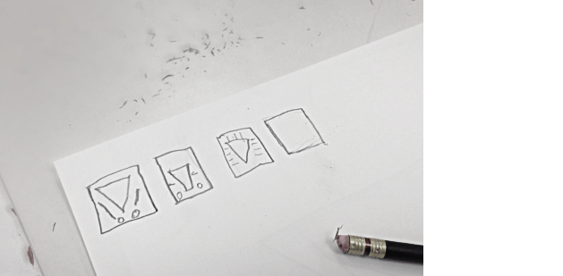
I throw them into a bootcamp. My goal: How many abstract shapes can I get them to make within a limited time frame?
I ask them to DOODLE. Stick to POINT LINE and PLANE – do NOT get illustrative.
Which doesn’t work. The illustrators MUST illustrate, it seems – but this stops when I shorten the time frame.
Music (looped):
Aleks Veksler, Flight of the Bumblebee [electric violin remix, slowfly edition]
I start them at three minute DOODLES. Then shorten it to one minute – then :45 – then :30 – then fifteen second sketches. Over and over and over again.
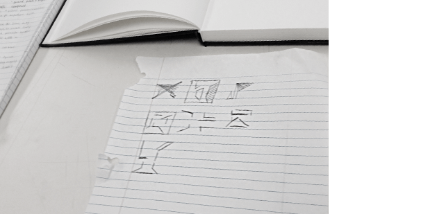
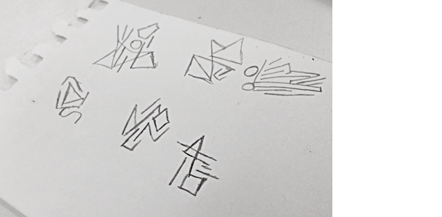
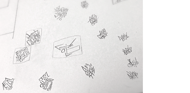
After about 20 minutes, I have them hand off their work to the person on their LEFT (opposite from last time) Then have them do 10 more minutes – improving upon what the other person came up with.
It goes well, though we do have to have an intervention with I Don’t Draw. The abstraction is just too much – but we’re all seeing improvement in her form – now that she doesn’t have time to apply literal meaning to everything.
‘What’s getting in the way is EGO and FEAR,’ remarks Waldorf.
(After class I refer I Can’t Draw back to Graphic Design The New Basics – to skim, it’s in the school library. It has far more examples than I’ve shown. I’m hoping it will help her with the final projects IF she just latches on to the concepts.)
‘Okay. No excuses. You each just did more than a dozen THUMBNAILS in a half hour. No reason you can’t do this with your final projects.’
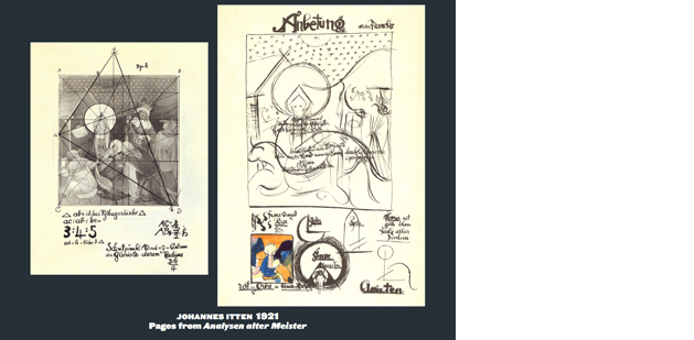
To review, I discuss how all these forms are the basis for just about every composition you’ll see out there: Graphic design, film, advertising, game design, the work of master painters (as broken out by Johannes Itten back in the Vokurs):
‘You’re ready for jumping into your final projects. Have research and DOODLES ready for next class.’
On to homework:
‘Find online and watch the sequel to MAX.’
‘Is it really the sequel to MAX?’
‘Yes, it is. Only, MAX won’t be mentioned at all, it was made by totally different people and the guy who plays Adolf Hitler actually is Adolf Hitler.’
Not available on DVD, once available on VHS, David Grubin’s Degenerate Art [PBS, 1993] is an excellent ‘sequel’ to MAX. Find online and watch, be prepared to discuss in our next class.
Also: Research! Let’s informally talk next class about the 9 masters you are researching.
Have MANY thumbnails DOODLES on Tuesday.
Plus, READ Design Basics Chapter 12, pages 243–47
Our final class will be NEXT FRIDAY.
—steve mehallo
Last year, FLOMM founder Steve Mehallo rebuilt a design fundamentals course into a five week study of theories and work done at The Bauhaus (1919–33). This BAU blog series will document the latest teaching of the course – with lesson plan – Summer 2015 to a group of 8 college students. What’ll happen, who’ll shine, who’ll drop. Names (and some situations) have been changed to protect the innocent as well as the guilty.
co
nti
nue
read
ing —
forward to BAU10 • • •
· · · back to BAU8
PLEASE SUPPORT FLOMM
DONATIONS DISCREETLY ACCEPTED


