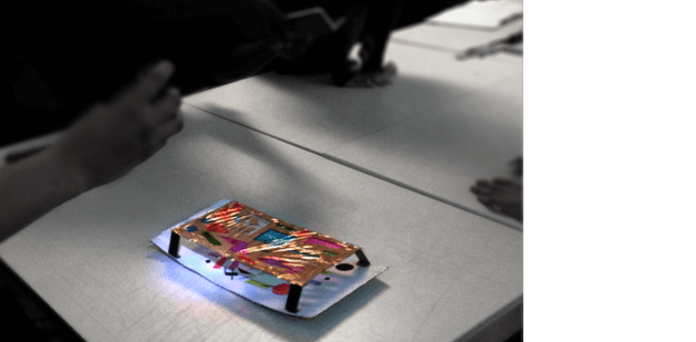
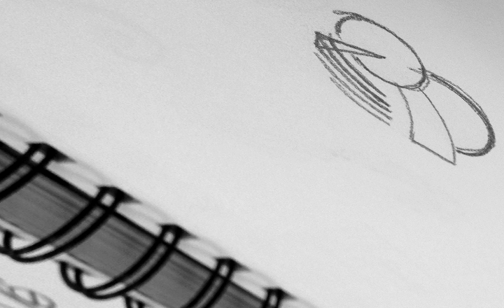
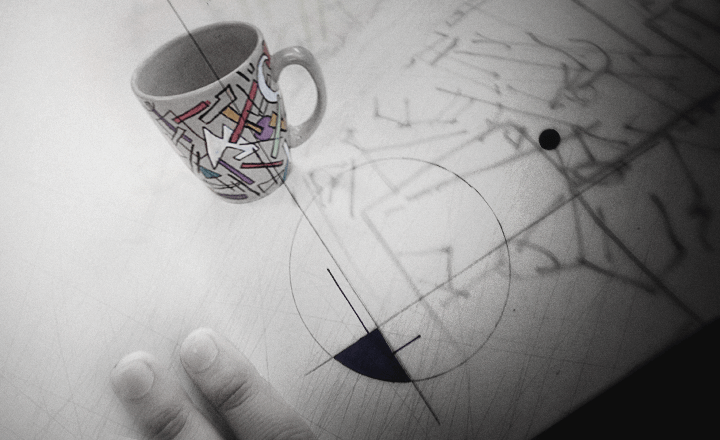
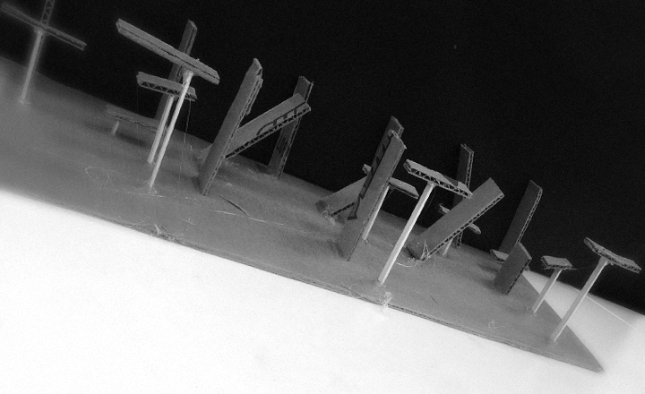
Student with the Bad Chicken problem is back. And he’s convinced he ‘caught’ it in the air – because the previous week we were discussing the Foster Farms salmonella outbreak. This concept isn’t too far fetched as we jump into today’s über-long discussion; the gloves are now off, we’re going into obsessive tinkering, beyond POINT LINE PLANE.
Today’s class becomes a conversation of the world-changing work of relentless experimenter, Bauhaus master László Moholy-Nagy (1895–1946).
To start, we have to get the pronunciation down. Moholy-NAWDGE (-ish). We say this a lot. American students typically not too familiar with Hungarian names.
‘Unless it’s Spanish, don’t expect the spelling to match the pronunciation.’
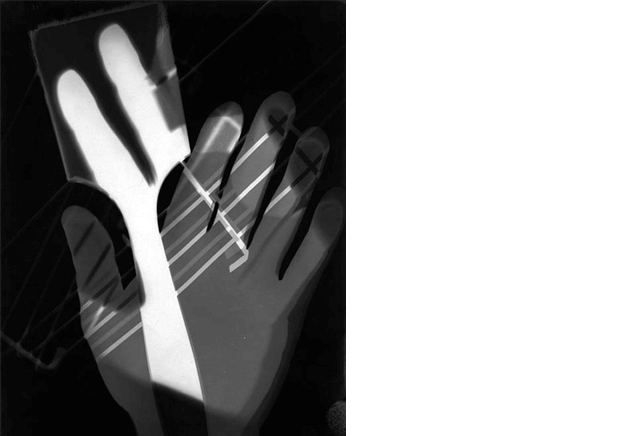
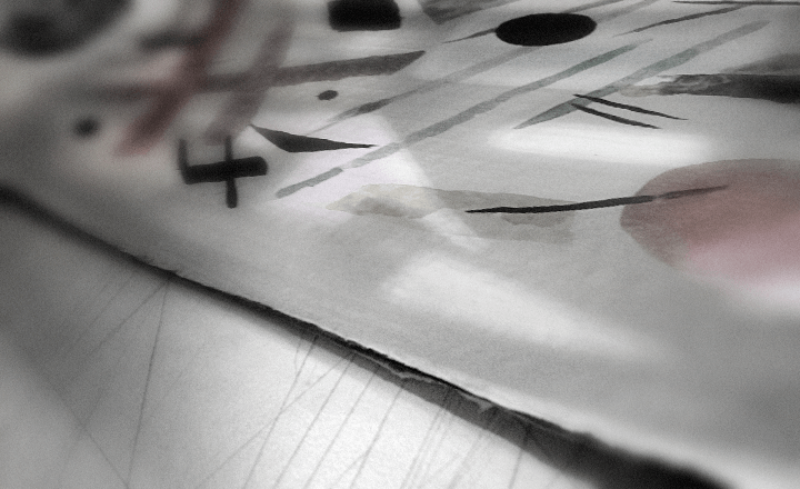
László Moholy-Nagy, Photogram, 1926
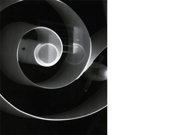
László Moholy-Nagy, Photogram, 1943
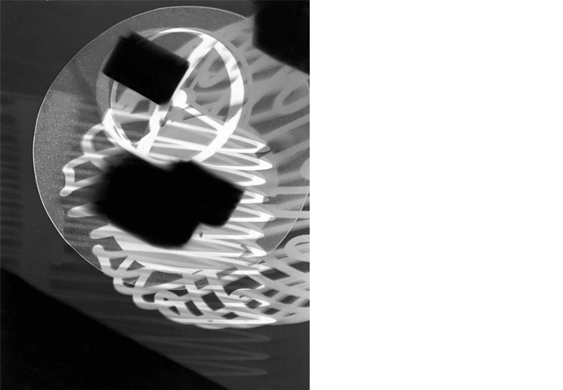
László Moholy-Nagy, Photogram, circa 1922–24
foto
We immediately jump into photography. Students bring in slides, experimental art and a lot to say. With some interesting POVs on photography itself, ‘Seeing things in a picture is a lot different than what normally see around us. And we don’t always see everything in the photo. Especially in black and white, that’s not the world we see. A photo changes it.’
I build off this: ‘Think about this: How does the one actually see the world without photography?
‘Unless you’ve actually been there, photography is how one actually knows what things look like.’
I lose them for a second, then ask, ‘Have you ever been to Windsor Castle? Then how do you know what it looks like?’
Photography.
I fill in a bit about how photography developed as a technology and art form, ‘Pretty much the first 80 or so years was people trying to perfect fast exposures and an image that wouldn’t vanish. After most of that got under control (photography is still, though, a temporary medium; old photos fade, digital photos can be deleted), it was photographer Alfred Stieglitz who argued that photography is another ART form – and that’s where the images really got interesting.
‘Painters rejected this technological thing as not real art. Same argument we’ve seen with modern art – same argument when computers became an art tool. Same argument with, well, anything fucking new.’
‘In photography there is a reality so subtle that it becomes more real than reality.’
–Alfred Stieglitz
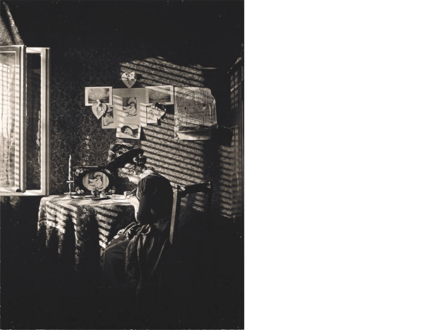
Alfred Stieglitz, Sunlight and Shadow, 1889
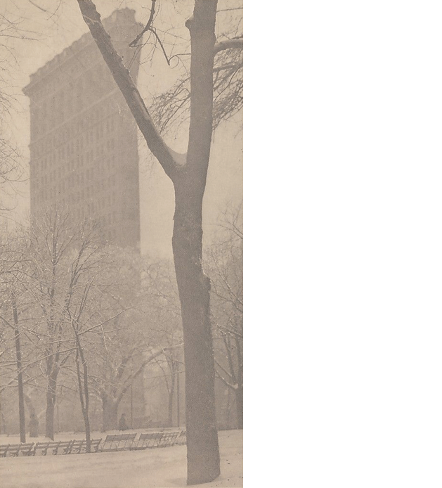
Alfred Stieglitz, The Flatiron, 1903
‘The enemy of photography is the convention, the fixed rules of how to do. The salvation of photography comes from the experiment.’
–László Moholy-Nagy
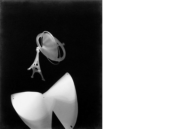
László Moholy-Nagy, Photogram, circa 1928
The students are enamored with Moholy-Nagy’s interest in photograms and how he’d make them, ‘His camera-less photos present another way of looking at the world.’
One student shows a photograph she made for a class by exposing leaves at different times in a darkroom (the others have lots of questions) and how cool it is to work in an actual darkroom, before jumping into Photoshop. They discuss how these experimental techniques become the art, and the concept keeps coming up: What would Moholy-Nagy do if he had the technology of today?
Another student goes into a description of the Inkodye process– as a contemporary example of something Moholy-Nagy could be into.
I mention there are a lot of artists working with similar techniques, such as flommist Dan Herrera and designer/poet Bob Dahlquist.
Dan has taken apart scanners, created large glass lenses for them – he is constantly playing around with vintage processes mixed with new media – and he just keeps going. His latest work are pure, old fashioned tintypes.

Dan Herrera, Estan de Una series
Bob has purchased outdated diazo equipment and uses its ammonia-based light exposure (originally used for large blueprints) to create new photographic works.
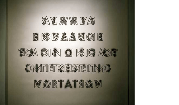
Bob Dahlquist, alwaysendeavor
Most of this thinking, abstraction, composition, of course, pioneered by Moholy-Nagy and other avant-garde artists of his time.
I mention Man Ray (artist with a superhero name) and his technique of solarisation; snap the lights on in the darkroom quickly, blows out the dark areas of the photo.

Man Ray, Untitled (Meret Oppenheim), 1937
And Photoshop – which began as a homework project (really) – makes it possible to tinker even more.
‘When the true qualities of photography are recognized, the process of representation by mechanical means will be brought to a level of perfection never before reached. Modern illustrated magazines are still lagging behind, considering their enormous potential! And to think what they could and must achieve in the field of education and culture.’
–László Moholy-Nagy
it’s design
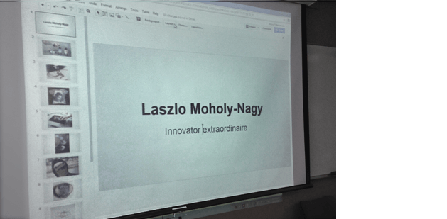
Somewhere in here I remind that the reason they’re taking this course is to have a visual language already in place by the time they fire up Adobe Creative Suite (and/or related applications). This, of course, leads to a critique of this student-made slide presentation:
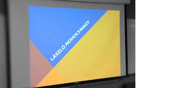
compared to this one:
Design everything.
It’s sort of my own neodesignerflommistphilosophymantra. If you’re going to be a designer, don’t just throw up a slide where the software controls what you’re doing. Every thing you make is an opportunity to practice what you are learning. Working with what you have, make it work!
(and the more you design, the better you’ll get. Hell, I used to design my collection of videotapes just for practice. Back to Practice Makes Good, from BAU1)
‘When he taught at the Bauhaus, he brought the teaching back to the original premise of the school, that is to make it a truly innovative place where modern art meets modern means of expression and solidified the value of machinery and other technology for use in visual organization of space in the places where we live and breathe.’
–student presentation
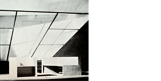
László Moholy-Nagy, Stage Setting for The Tales of Hoffmann, State Opera, Berlin, 1929
An opera stage, designed so the music can project forward to the audience! Student notes that the stage is black and white, simple geometry – so the colours of costumes and the performers stand out. THEY shine over the stage, not the opposite.
some art
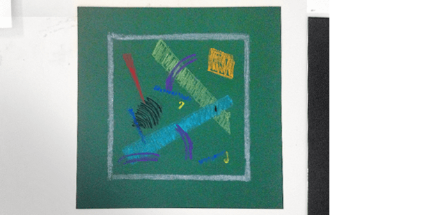
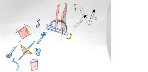
Students continue to build interpretations as part of their presentations – and the cool thing is (finally) happening that I hope happens in all my classes; they seem to be enjoying not only coming up with the ideas, but actually working on their projects. Well, that is the students present (absences are still a problem; especially with students who are barely into the concepts of the second or even third class). Those present are having fun:
The last one is the latest work of the student who was running away from WHITE SPACE. On left, he started with an illustration of his son, we note that the individual elements in his work are stronger as individual pieces than a whole, and point out he’s getting it. Next step is to move away from the subject matter and build abstractions that really work.
it’s film
Waldorf brings in another detailed report – and shows one of Moholy-Nagy’s short experimental films:
László Moholy-Nagy, Ein Lichtspiel Schwarz Weiss Grau, 1930
The film was created using his Light-Space Modulator, an experimental lamp made from found materials – that could take light, bend it, move it, creating new abstractions (here’s the device in colour) (and yes, I do bring up Marvin the Martian because I have to).
I note that he was so particular about details, that one could take any frame from this film and turn it into a piece of art.
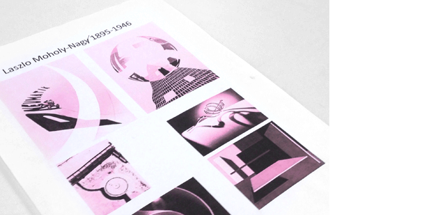
She has a very pink handout – that I note works great because her printer ran out of ink. Moholy-Nagy would love this sort of experimental thing, I’ve even taught classes where the colour came from this sort of printer faux pas.
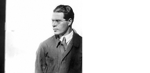
She brings in a lot of Moholy-Nagy’s background; From Hungary, added ‘Moholy’ to his surname (after the name of the Hungarian town he grew up in), had a law degree, was in World War I, replaced Itten as head of the preliminary course at the Bauhaus, et cetera.
‘He turned the Bauhaus into an industrial design school – made it a truly modern place,’ comments another student, ‘rather than Itten being all do whatever the fuck you want while eating garlic paste.’
focus
We also put a lot of this into historical context. Class conversations are great way to get ideas into student brains.
Because Russia keeps coming up in their research, I bring up the jump from cubism > futurism > Russian futurism and how the Russian avant-garde really took the idea of a modern revolution and made it the identity (brand) of this new experiment – the Soviet Union; which sort of fucked itself by allowing a paranoid to be in total control of the entire country; and how all this was going on and influencing the Bauhaus (still don’t bring up De Stijl tho; gunna wait). Then on the war front, there were the abstract vorticists, out of Britain, run by a very good writer – and asshole – Wyndham Lewis. Vorticism-inspired abstract camouflage for ships – which led to a crack from Pablo Picasso – and a discussion about digital camouflage used in the Gulf War and techniques for camouflage in use today.
Student remark: ‘I’ve learned two Russian phrases this week: Kiss me and Leave me alone.’
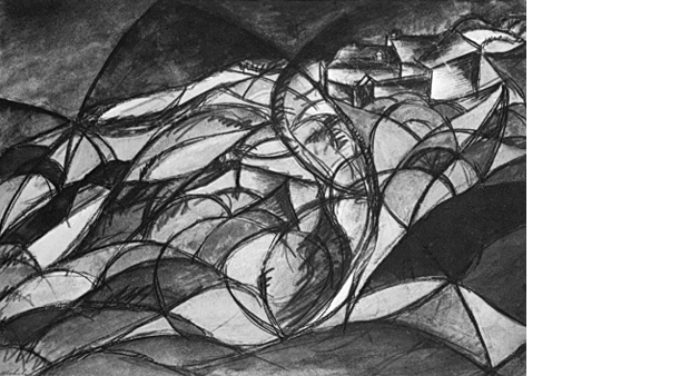
László Moholy-Nagy, Hungarian Landscape, 1918
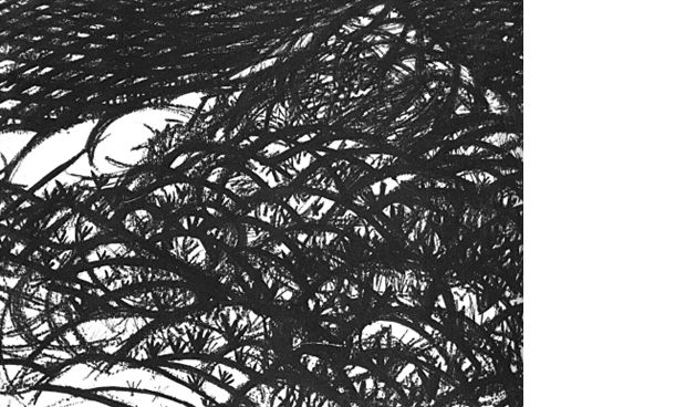
László Moholy-Nagy, Landscape with Barbed Wire, circa 1918
moholy-nagy’s jump into art
Moholy-Nagy’s jump into art happened as an artillery officer during World War I – on the front lines against Russia and Italy. He drew what he saw; in the style of the day (one can see the style influences of Kandinsky’s Blaue Reiters).
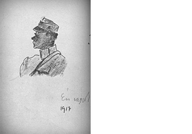
László Moholy-Nagy, That’s Me, 1917
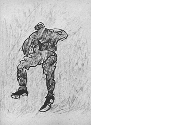
László Moholy-Nagy, Reclining Soldier, 1917
The student presenting this also manned artillery in Iraq and has a personal take, ‘You need something to get you through that. Anything you could do. And in that time frame – WWI – it was crazy. Art was probably the thing that got him through the war.’
The same student also sums up Moholy-Nagy’s obsessive work ethic, ‘He was a Hungarian, lawyer, painter, photographer, sculptor, filmmaker, designer, teacher … and on the side, he was a husband.’
Which says a lot.

László Moholy-Nagy, Self-Portrait, 1920
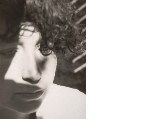
László Moholy-Nagy, Head (Lucia Moholy), circa 1926
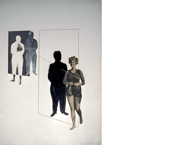
László Moholy-Nagy, Celos, 1927
Homework:
Moholy-Nagy CONSTRUCT ASSIGNMENT
First, come up with a list of random words (using a dictionary helps. Be a DADAist in this context – look up what you need – then stop being a DADAist)
Then, create a Moholy-Nagy construct.
You can use any materials, 3D, plastics, music, light, etc.
This time, your square can be any size.
Incorporate geometric renderings of *TYPOGRAPHY using at least three of your random words.
*For TYPOGRAPHY, I’m providing students with a READER copy of content from Jan Tschichold’s Treasury of Alphabets and Lettering (1966). I used to use this (now out of print) volume as a textbook – and there’s good advice in there on how to work with type. But in this case, I’m just asking you to interpret the font samples as geometry; i.e. applying POINT LINE PLANE to the letterforms.
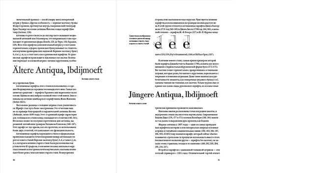
I quickly demonstrate how geometry appears in type:
Plus, there’s this:
And, here’s something that students from a Digital Type course I used to teach once made:
For further reference (will help with this assignment), look up Bauhaus guy/typographer Herbert Bayer (1900–85) and Bauhaus cosplay fanboy Jan ‘Ivan’ Tschichold (1902–74). Unfortunately, we won’t have time to cover their contributions in this course (I go over them in great detail in most of my other courses).
Plus, READ Design Basics Chapter 10, pages 196–201
office hour
After class I have a long talk with Star Wars – who again, doesn’t have homework. We discuss what he’s getting out of this class, his frustrations (with life), and I discover he has a love of typography. I talk about why all this stuff is important (read your textbook!), and how going over all that we’ve covered so far – credit or not (I don’t accept late work) making sure he understands this work will allow him to do great things in his chosen major, graphic design.
But I reiterate: I don’t believe in passing students who do not know the material (I’ve said this a few times). Because this work gets progressively more difficult (this is the easiest class I teach), and I’ve seen students’ HEADS EXPLODE when they move on and can barely do the next level of work.
—steve mehallo
Last year, FLOMM founder Steve Mehallo rebuilt a design fundamentals course into a five week study of theories and work done at The Bauhaus (1919–33). This BAU blog series will document the latest teaching of the course – with lesson plan – Summer 2015 to a group of 8 college students. What’ll happen, who’ll shine, who’ll drop. Names (and some situations) have been changed to protect the innocent as well as the guilty.
co
nti
nue
read
ing —
forward to BAU8 • • •
· · · back to BAU6
PLEASE SUPPORT FLOMM
DONATIONS DISCREETLY ACCEPTED


