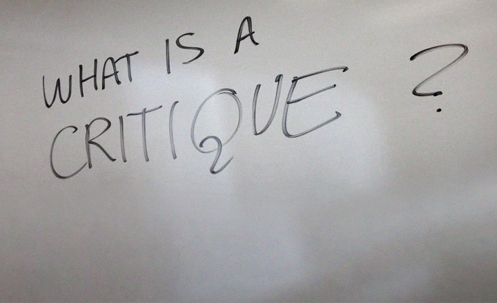
I walk into class and I get faces. Really depressed student faces. I ask what’s up and: ‘We’ve discussed it. Our work is BAD.’
Followed by ‘We’re in a teacher-induced, depressed classroom.’
My response: ‘No, no, no, no, no, you’re not putting this on me. We’re going to talk this through.’
Somehow my system of (1) give them tools and things to read, research, learn, followed up with (2) a problem to solve – wasn’t working. So we spent a lot of time taking everything apart. Figuring out what went awry.
That is, once I get students to actually open their closed drawing pads. So I can actually see the work they are hiding from me.
not my best work
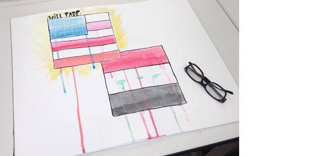
Again, the former Waldorf student jumps in and (for the most part) nails it. But was throwing around comments like, ‘This is horrible,’ with ‘Homework was confusing’ and ‘I have expectations; I want to make it something, I want it to be more!’ with strong feelings about how screwed up her watercolours were. And how they were the worst pick of media for this project. And she wished she could know how to use ’em better.
For improvement, I mention seeking out water media artist Dale Laitinen. He works BIG. I love his industrial work, even though landscapes sell much better. He teaches workshops locally. Go find. (I usually drop any references to anything that’ll help. First time I saw Dale’s HUGE work I got dizzy.)

Dale Laitinen, Over The Top
Chicago oil on linen, 42×72 inches
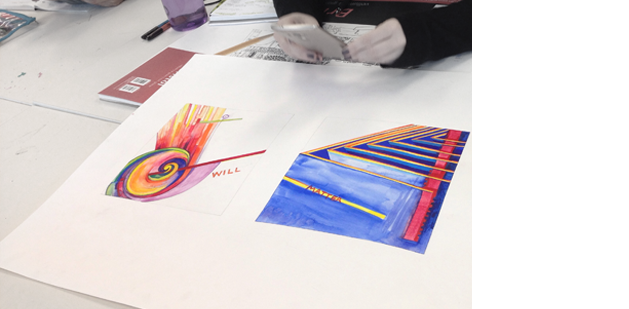
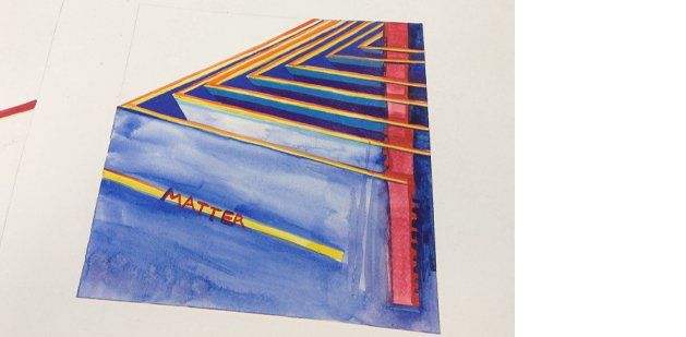
As we get into the work, we discover interesting relationships between Itten’s color theory applied to the subjects of POLITICS and POWER. She explains, ‘Rippled effect with triangles is the intent, push, take, give, applied to political power.’ There’s one line of handlettered MATTER going up against a jagged red bar (influenced by barbed wire) designed to keep things out.
We discuss how it could go a bit farther – maybe the bar is more jagged or more of an angle to the MATTER line; either way it DOES work. Works well.
The student is having a hard time with abstraction, which is typical for most humans. We WANT realism! It’s normal to feel uncomfortable with it, which is why it took so long to catch on. I mention we’re going to be studying Kandinsky, who is credited with inventing abstract art (which isn’t quite true – the Futurists did. Well, sort of. They had it, but sort of didn’t show it. It was even too weird for them.) (Info in this book).
I then reference Against Kandinsky, which breaks out what he was up against.
channeling futurismo?
She talks about what her piece would look like if there were humans added – and I remind the group that we’re working with are the building blocks for compositions; you can add a dose of realism as it were, but working directly with the form is better than adding materials at this point.
I’m starting to feel – in today’s class – that I’m repeating myself. A lot. More on that in a bit.
Then I have them look up work from the Futurists. It IS great students have phones with the interwebs on it. They can reference through an image search and have materials on their screens fast, quick. They find Russolo.

Luigi Russolo, The Revolt, 1911
Cries of ‘You plagiarized this!’ are defended with No, you created your own thing and just happened to recreate something that already exists. But different. It IS your piece.
I go over a brief history of Futurism (with a bit on how I referenced it for FLomm) – minds are blown by the work of Umberto Boccioni (1882–1916).

Umberto Boccioni, Horse+Rider+Houses

Umberto Boccioni, States of Mind II: Those Who Go, 1911

Umberto Boccioni, Materia, 1912
We talk about Boccioni’s mommy issues (that’s his potente mamma in the last piece). And lead Futurist Marinetti pissed off a lot of people – including supporting gender in-equality even though he was pussy whipped by his wife. And Fascism. And Mussolini.
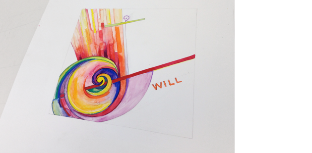
‘I have a will, It’s not going to confine!’
And it doesn’t. For her next piece, I point out the messiness of the watercolours are what helps.
This study references her earlier work a lot closer – starting with a hand holding on to barbed wire and taken to abstraction. I bring up metaphors, how the energy lines can be interpreted as motion, highways, pipes on an organ; only critical change I’d consider is to put more of an angle on the elements, but they do work. I interpret a squiggle (at top) as a rod and staff ‘guarding sheep,’ not her intent, but it does lend itself to meaning. Like poetry, like music, abstract art is open to interpretation.
At this point I consider referencing De Stijl – but I decide to keep it out of the course right now. We’re still at a point historically where De Stijl hasn’t yet taken over the Bauhaus.
After two good critiques, she’s shocked her pieces work. And for the first time this quarter, tears come. Happy tears.
‘The greater the artist, the greater the doubt. Perfect confidence is granted to the less talented as a consolation prize.’
—Robert Hughes
‘My process: Bang my head against the wall for four days straight.’
—student
‘Yeah, I saw him driving on the freeway – banging his head on the window!’
—other student
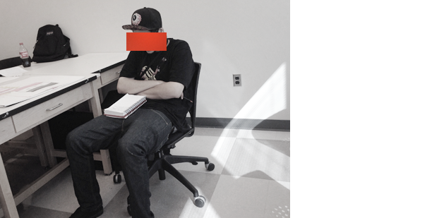
I go on break, come back. See the folded arms, slouch. Big dent in wall.
shiny stars
Elsewhere, I have two students who were absent last week who’ve done nothing to catch up. They missed the part (in my syllabus legalesus, which they’ve signed) that they’re responsible for everything we cover in any class they miss. I don’t collect late work (another one of my things) – but they do have to get caught up. With the reading, MAX (and his little buddy Hitler) et cetera.
We talk about stars – cause politics – and how hard they are to work with. Because they’re triangles all pointing away, with sort of a space in the middle that could actually be a middle. They drive me nuts! I feel sorry for Macy’s running with their stars everywhere and somewhere in there I throw in, ‘I’d like to just go back in time and slap Betsy Ross.’
The rest of the class turns into another therapy session. Pretty much the same as before – tied into students trying to show what they already know, instead of working on new things. In fact, new things seems to have gone out the window, I see work that looks like their work went backward before I brought in Itten. They may have … reset buttons?
I try not to retread old territory, and attempt to cover other issues we haven’t discussed, such as homework feeling so much like homework, it’s natural for students to not want to do it.
I mentioned I have had the I think this is a cool assignment, but I didn’t do it ’cause it feels like homework thing before. Enough that I once cornered our Sociology professor (who has at least 5 degrees in human studies) and asked, ‘How do I make homework not feel like homework?’
He laughed and kept walking.
Four classes in, I’m finding some of the students are not reading (with excuses), not doing research, leaving their homework at home (I have this student recreate her work in class) and doing whatever feels comfortable as their work, avoiding what they don’t want to do. As a result: much of the work isn’t very good. And doesn’t contain what they should be learning.
I ask another student to show his homework and he said, ‘I didn’t do it.’
I bluntly respond with ‘That’s an F then … next student,’ and made a note of his grade.
He then declares, ‘How dare you! Shame me like that. I’m an adult. I’m paying 30 grand for this school! I’ll decide what work I’ll do and not do.’
Everyone falls silent. We move on.
After two hours of discussion, I notice another student’s notebook – there’s a blank page with the word Notes at top. I ask why it’s blank and the reply is: ‘No one has said anything important yet.’
I remain positive, use slides to introduce them to the third concept – PLANE – talk at lot about the images and how they work, how the planes are constructed to lead the viewer’s eye around the poster examples. The talk a lot about how the colour is working (Itten’s influence). We then veer into homework:
RESEARCH the work of Wassily Kandinsky (1866–1944)
Bring in your research for next class. Be prepared to present your findings in any way you see fit. Read a report, slides, video, performance art, whatever.
And ‘if class is boring, it’s on you.’
Also: Find a piece of scrap: metal, paper, garbage, something that reminds you of Kandinsky’s work. Bring it to class (we’re going to work with it).
Plus, READ Design Basics Chapter 4, pages 70–71; 82–85
Bonus: Starting next week we’re going to be using concepts from the website FOTOFORM. Drop by, take a look at the site. There’s usually a lot of questions concerning the concepts, so have some. So I can clarify before you jump in.
high note
As a group, they decide they want to do better work. I tell them they’re going to love the music part of Kandinsky.
They set out to tackle the work, while I stay behind to talk to the blank Notes student, who also had no homework (which makes it hard for me to assess what the student is actually learning). I ask how the class is going and I get I’m not used to this kind of work, and I don’t talk to anyone. I give a positive pep talk, and hope it hits its mark. Though the message I’m getting is: I’m not going to do anything outside my area of comfort. Even though there was a smile upon leaving.
‘Never tell me the odds.’
—Han Solo
This student is into Star Wars. I’m going to come at it from this angle.
—steve mehallo
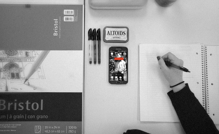
Image up top: OCD-organized desk space
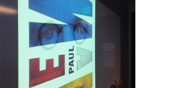
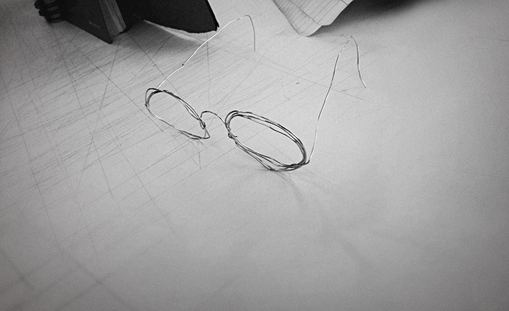
Paul Newman image by Ralph Schraivogel: Used in my slides as a PLANE example with Kandinsky spectacles I added to make homework more exciting!
Last year, FLOMM founder Steve Mehallo rebuilt a design fundamentals course into a five week study of theories and work done at The Bauhaus (1919–33). This BAU blog series will document the latest teaching of the course – with lesson plan – Summer 2015 to a group of 8 college students. What’ll happen, who’ll shine, who’ll drop. Names (and some situations) have been changed to protect the innocent as well as the guilty.
co
nti
nue
read
ing —
forward to BAU5 • • •
· · · back to BAU3
PLEASE SUPPORT FLOMM
DONATIONS DISCREETLY ACCEPTED


