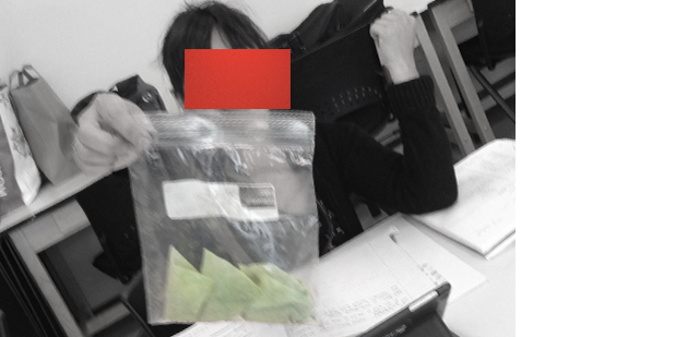
This week we’re finally awake. Because a student has brought in REAL 100% Japanese tea. As a counter to the last blog post about what Americans think TEA actually is.
Bitter, green and strong. No sweetness here, some water and we’re ready to jump in.
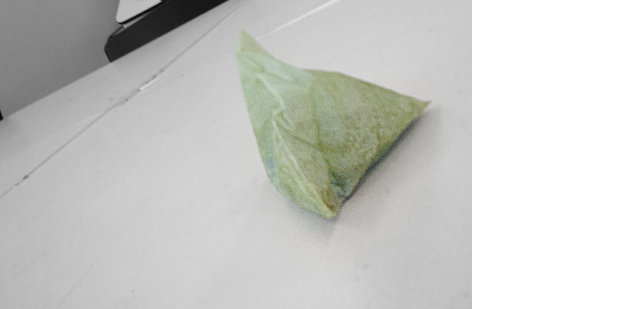
(Really hoping this actually is tea)
degenerating
Reaction to the Degenerate Art documentary is strong: ‘Hundred years ago they’ve would have KILLED us for what we’re making in this class. Lives were destroyed, that was horrible!’ Bad Chicken watched the documentary twice, still shocked at the content.
Well, give or take about 20 years. Students mention when they usually watch things about the Nazis, they don’t cover art. Before this class, who even knew Hitler was an artist – ?
Bad Chicken continues: ‘This opened a whole new thing I never learned about – if you did different art – if you LOOKED different, you could be killed for it.’
Strong statement. A comment that crosses decades.
I ask, ‘How far are people willing to go if one just looks different?’
Of course I’m referring to the world today. Once one studies history, patterns emerge. People do NOT like change, do NOT like new. And it’s an ongoing process. Abstraction was not only frightening, but dangerous and banned.
I can even get into how the abstraction in the FLomm game has turned off some gamers, because the game play environment isn’t familiar. Been asked a few times, ‘Why can’t it just be outer space or something?’
‘People attended the Degenerate Exhibition and were shocked at the work they were seeing. So how is this different today; personal expression in clothing, tattoos, piercings, lifestyle – is the backlash any different; or even worse: How far are people willing to go to stop what’s new?’
Footnote: Look up what happened to Kazimir Malevich, after Josef Stalin turned against the avant-garde in Russia.
As with any of these classes we have a discussion. About today. Don’t change my world, I like it just the way it is. What about people who don’t have the rights you have? Who cares, they must have done something wrong. (things I’ve heard a lot over the years).
The world today: Human behavior doesn’t change, it just adapts.
I note VICE’s coverage of ISIS – online and on HBO, where ‘they’re doing what 60 Minutes SHOULD be doing.’
Hitler also hated jazz. New forms of music were also outlawed, check out the film Swing Kids (1993) for the musical side of things.
And yes, I also compare Nazi Germany to the town in Footloose. Because.
A student brings up Robin Williams in Jakob the Liar (1999) and Life is Beautiful (1998) – and we mention Amazon’s pilot The Man in the High Castle (2015), adapted from a Philip K. Dick story, that runs with the concept what if the U.S. lost World War II? Historical fiction is a great way to bring to life (and fill in gaps in) history. Same thing with class.
art deco + threads
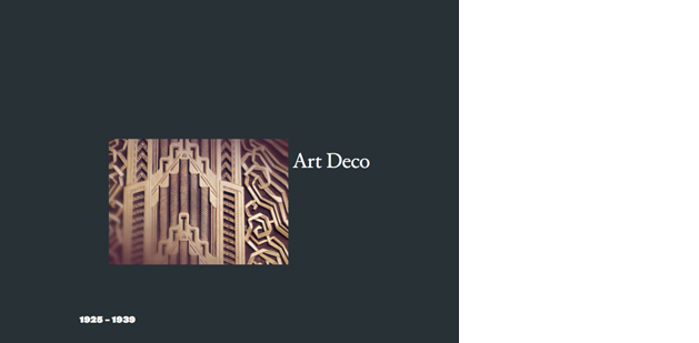
To fill in at this point, I add a lecture showing what happens to modern design outside the Bauhaus. How decoration intermingles with Modern to create Popular Modernism, what we know today as Art Deco.
‘In order for Modern to reach a larger audience, abstract gives way to a decorative approach. That’s where what we’re learning brings illustrative form back into play. In fact, books were published to show how anyone can design in the modern way!’
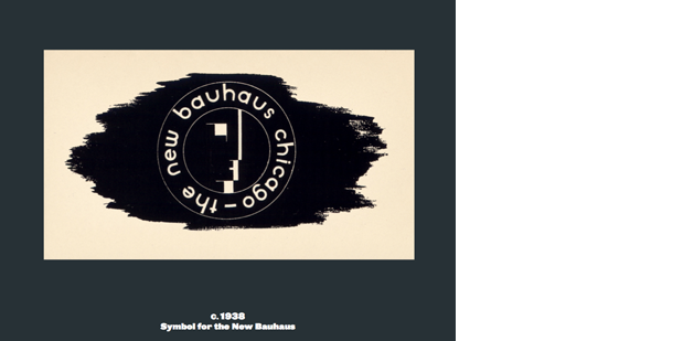
We talk about the Bauhaus in the U.S. – after the Nazis shut the school down in 1933 – and how anti-German sentiment (reinforced by WWI, regulations against German bier breweries in Milwaukee as a major part of prohibition – and WWII on the horizon) managed to close down the Bauhaus again – in Chicago (Moholy-Nagy wasn’t even informed what happened, he was told by his students the school was being shut down).
all thumbs
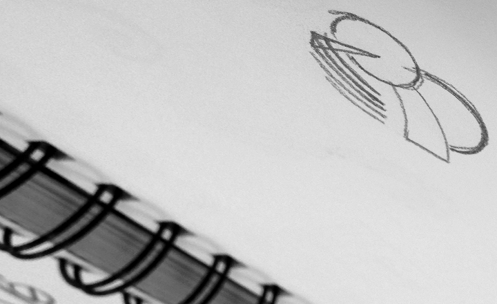
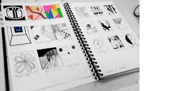
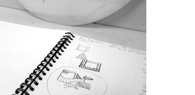
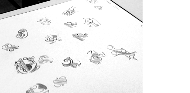
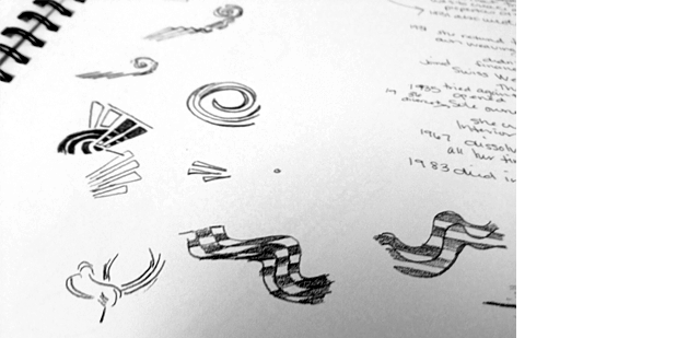
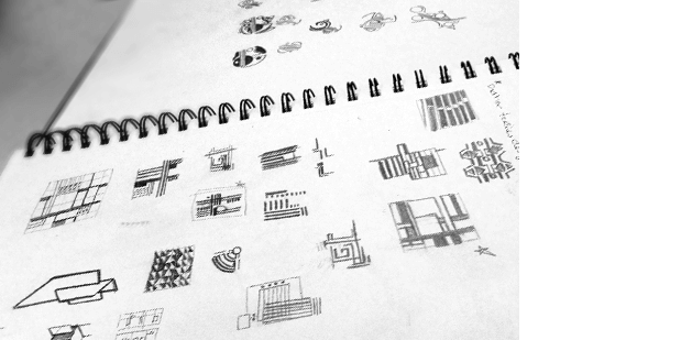
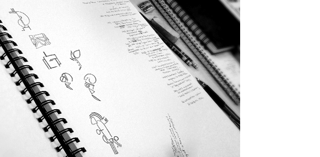
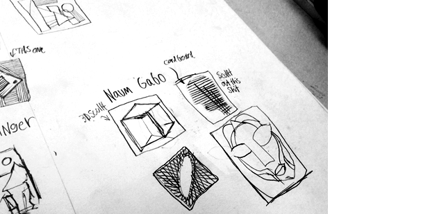
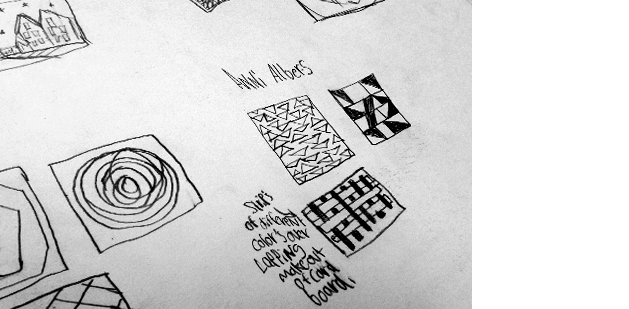
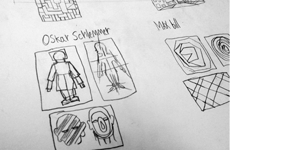
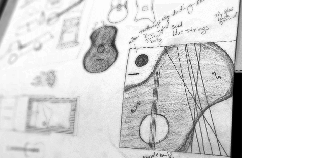
Up next, we look at student sketches.
Then we discuss Max Bill, mathematical thinking and The Swiss International Style – I cite him as being at odds with Jan Tschichold – after Nazis arrested Tschichold – which may have resulted in Tschichold abandoning The New Typography and bringing classicism back into his work (say Tschichold three times fast).

Max Bill, Print, 1938
We discuss other Bauhaus masters – such as Gunta Stölzl – who built her work to match the weaving equipment – and I draw a comparison to the way things are designed at Italian fashion house Missoni.

Gunta Stölzl, Textile Design
Marianne Brandt and collage – being a forerunner of Photoshop. One can make anything out of photos, all one needs is scissors and glue!

Marianne Brandt, Collage
Lyonel Feininger, who provided ‘atmosphere’ at the bauhaus (I think of him as a thin John Cleese) – American cartoonist who spent most of his time experimenting in the Bauhaus print workshop.

Lyonel Feininger, Bird Cloud, 1926
Paul Klee didn’t know colour, so he went to Tunisia which had incredible lighting (great place to shoot a Star Wars film) and learned how colour really works, ‘Colour has got me. I no longer need to chase after it. It has got me for ever. I know it. That is the meaning of this happy hour.’
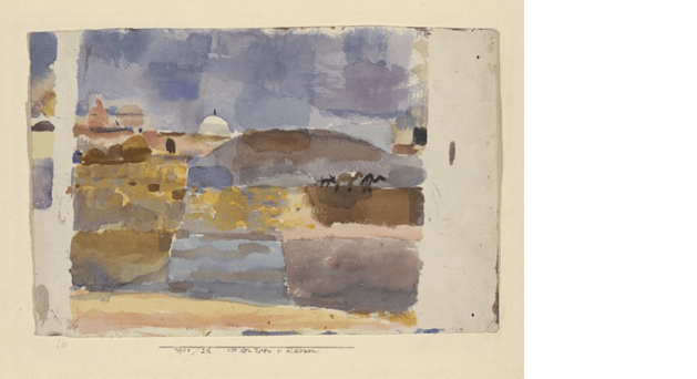
Paul Klee, Caffè a Tunisi, 1914
back to the beginning
So the basis for what we know as design is still frightening to some. And this seems to be the big topic again this week.
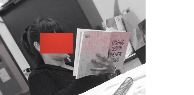
I Don’t Draw decided to shore up things – checked out Graphic Design The New Basics (as I recommended) – and signed up for a weekend life drawing class. To learn to draw.
We did note, we see a bit of Picasso in her work. And there’s something cool going on with her abstractions.
But, as she’s working on her studies for her final, there’s NO WAY she can create anything that doesn’t have a drawn image tied to it. For the music genre images, for I Don’t Draw, every genre MUST be represented by something literal or she simply can’t do the project.
We’re back to BAU3, as we talk about techniques for getting past what’s in one’s head. We discuss again Things Have to Be This Way and I Don’t Do This and I Don’t Do That. And how rushed this class was as a summer course (it IS a summer course) and (the line I hear the most in ALL my classes), ‘I’ve Never Done This Before,’ which is usually what I hear just before a student turns in crappy work.
‘You’re here to do what you’ve never done before. Otherwise this isn’t college …
text
Then … ‘Holy shit,’ comes from one of the students.
She’s reading her phone. It’s from I’ll Decide What Homework I’ll Do. He hasn’t been in class since I saw him in the hallway.
‘Apparently he’s in the President’s Office.’
‘University President – ?’
‘Yeah. The text says, I’m here with the President of the school. He’s really concerned with the class. He is headed over with Campus Police. The teacher is fired & is going to be replaced.’
If you ever feel your heart stop, without a real heart attack happening, this is it. This is not going to go well. I brace for whatever is going to come next.
‘My mother thinks you’re crazy. What you’re teaching is not ordinary,’ says another student. He looks pretty pissed off at what he’s doing. At this point, they all do. Especially I Don’t Draw.
Staring at me. They’re all staring at me. Somehow I press on, shaky voice I decide to continue the class. ‘Great this, is going to be fun.’
All I can think of, tho, is fifteen years of teaching and somehow an angry student has brought in a college president to end my career.
‘Well, I know art and that’s not art!’ resounds from a student I haven’t seen in weeks.
‘You always have to learn things the hard way. Can’t do things the way everyone else does them.’
‘There are ways things are done around here. Why do you always have to change things?’
‘You’re a horrible person. If you’d just listen to me everything would work out.’
‘Wait, you actually care if they learn? What if they don’t care, it really shouldn’t concern you. They’re adults, let them be.’
‘They’ll eventually learn college doesn’t teach anything. Life is where you’ll learn.’
‘You actually teach the curriculum? What’s wrong with you? You should teach what you know. Curriculum is for the bureaucrats in the meetings. Just give them a few things to do, some quizzes and move on. That’s all I do, so I have time for my art. They don’t care so I don’t care.’
Don’t like these voices. They hammer, over and over. Time for a subject change …
type
Somehow TYPOGRAPHY – as an art form, as something necessary, keeps coming up. I covered it quickly a few classes ago, so I go over a few other things worth mentioning. Even though my mind is on the cops that are about to show up.
‘Type is like music. It’s almost as old as music, tho we don’t know how old music is, cause type wasn’t around so no one could write the date down.
‘Also, anywhere type appears is Graphic Design.
‘So typography is the most important component of graphic design – and even tho the general public believes that type just appears out of thin air, it’s overlooked, taken for granted, a utility – tho it is as complex a field of study as anything else we cover. That’s why I teach so many different type courses.’
We talk about the complexity of music and how type can be just as nuanced. We discuss the purpose of type, ‘to convey a message,’ or more direct, ‘to be read.’
I then talk about what happens when artists (or students) get their hands on type for the first time. They want to play with it, fuck with the letters, do crazy things. And typically this gets in the way of communication. Type is rooted in history, changing our alphabet – the way we read – really screws with things.
Not to say, it hasn’t been tried.
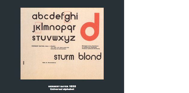
I bring us back to the Bauhaus and Herbert Bayer’s Universal Alphabet (1925). The idea was to limit type cast in metal to just one case (being an economic, even green solution). Bayer came up with an alphabet (devoid of decoration) that was mostly lowercase. Because lowercase is what we read most, why use uppercase if it’s really not necessary?
The idea didn’t catch on. Until around 1961, when designer Paul Rand adapted it for the American Broadcasting Company:
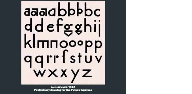
Outside the Bauhaus, Paul Renner ran with the idea of a Geometric typeface – adapting concepts from the Bauhaus to create Futura.
But, of course, even Renner started with a screwy version.
For about five years, he lectured about his Futura experiments. And this led to others creating geometric sans serif types before Renner was done with his.
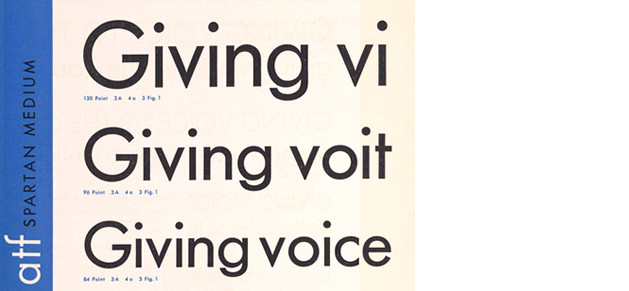
Eventually Futura was released. Cleaned up with just enough traditional type elements built in that it holds up today – as a rational type, with humanist elements. And this pissed off the Nazis, who subsequently arrested him.

(Note the curved strokes on the lowercase a and the counters on the e. Based on penstrokes, these are the humanist touches he added.)
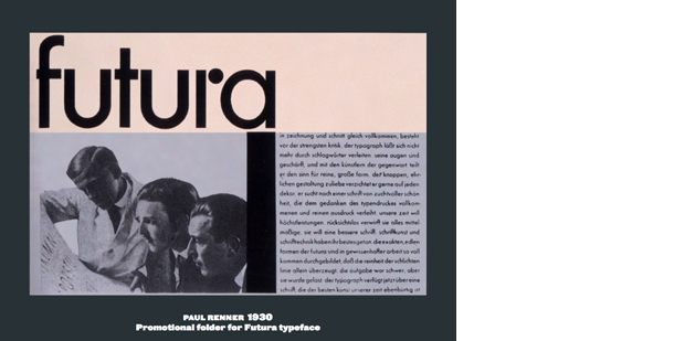
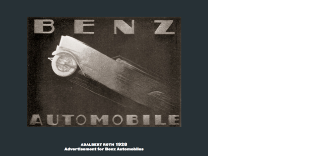
Marketing materials for Futura, showing the latest modern automobile of the day:

Futura! Good enough for The Royal Tenenbaums and good enough for Field Notes.
and then, nothing
We continue the class discussion of type, going over more masters, more sketches – and eventually the clock runs out.
It’s noon, class is over and the College President isn’t here. The bullet seems to have been missed. For now.
Homework:
Finish your studies. See you on FRIDAY.
—steve mehallo
Last year, FLOMM founder Steve Mehallo rebuilt a design fundamentals course into a five week study of theories and work done at The Bauhaus (1919–33). This BAU blog series will document the latest teaching of the course – with lesson plan – Summer 2015 to a group of 8 college students. What’ll happen, who’ll shine, who’ll drop. Names (and some situations) have been changed to protect the innocent as well as the guilty.
co
nti
nue
read
ing —
forward to BAU11 • • •
· · · back to BAU9
PLEASE SUPPORT FLOMM
DONATIONS DISCREETLY ACCEPTED


