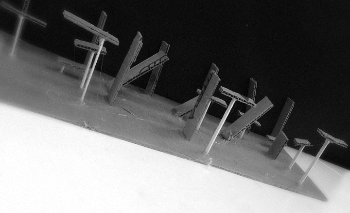
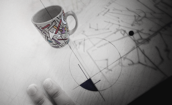
Last year, FLOMM founder Steve Mehallo rebuilt a design fundamentals course into a five week study of theories and work done at The Bauhaus (1919–33). This BAU blog series will document the latest teaching of the course – with lesson plan – Summer 2015 to a group of 8 college students. What’ll happen, who’ll shine, who’ll drop. Names (and some situations) have been changed to protect the innocent as well as the guilty.
‘I don’t remember any of that. It was over a year ago.’
… This became something I’d hear over and over in my advanced graphic design courses. Students would file in with their work to be critiqued and I’d sort of just stare at the work – wondering why basic form, color theory isn’t considered.
Design studies are supposed to be based on a pyramid. This was not happening and I wanted to do something about it.
foundation studies
Design fundamentals are critical building blocks that allow students to increase their skills in incremental steps. That’s the pedagogy. Students start at bottom and work their way up.
The problem is: As part of a curriculum, the steps weren’t aways working. Students were not transferring (the educational term) their studies from one class to the next.
A few years back, I decided to poll a Typography 4 course on my first day of contact:
‘What do you expect to get from this class?’
The response was: ‘We want to get a grade.’
No one in the group brought up knowledge, learning craft, skills, anything a bright eyed student should want. ‘just a grade.’
And as I dug deeper (over weeks of work), most of them just wanted to finish and Get That Job. The highly-paid graphic design position where they drink wine, make tees and hang with Karsashians.
(though oddly-enough, I do have a few former students who have jobs like this. So much for debunking that.)
reimagining basics
So a year ago I was asked to teach – in a rush, last minute sort of thing – a mid-quarter college-level design fundamentals course. Had about a week to prep, and was already buried in about six other classes.
I remember hearing, ‘Oh. I thought you taught this before.’ I hadn’t. And that’s what was about to help with this. Because I wasn’t totally sure what I was walking into.
I always start with established curriculum and learning outcomes. This course covers fundamentals of composition, colour, and typography in developing layout; good craftsmanship (organization, skill, expertise, precision, neatness); thumbnail sketching, and (most important) develop skills for the use of critical thinking – while identifying areas for improvement – in your design process. With a pre-picked textbook that rather bluntly breaks out techniques to teach, with historical examples:

Design Basics 8th Edition by David A. Lauer and Stephen Pentak
Cengage, ©2011, ISBN: 978–1111353988
It led me back to the problem I kept seeing: Transfer. How do I get the students to not only do this work – which they often won’t see the value in – and get them to keep the knowledge in order to produce better work in their later courses?
I set out to change things. Reimagine design fundamentals. Cause if I remember correctly, I forgot my earlier studies too – and had to rethink them years into my design career.
bau
Staatliches Bauhaus (1919–33) is where design fundamentals originated.
And with my love of history, what if The Bauhaus itself became the focus of the course? Where students experience the personalities and situations that created the foundation studies that are used in art schools and design programs around the world?
My mind raced through what could be done with this! There is so much in Bauhaus theory that I could easily overwhelm these unsuspecting students – by taking them in a direction of who, what, where, when, why, how, theory, theory and more theory!
This could be GREAT or a total nightmare! (ahhh, my kind of reckless funn)
Oddly enough it went well. A year later, I have advanced students who are doing wonderful visuals, considered layouts, colour and experimental thinking.
lesson plan
This post, of course, is to blog my latest teaching of this course. The lesson plan starts with figuring out who is taking my class. This helps me break out what their interests are so I can (attempt) to play off of them.
Friday morning, I ended up with a small (8) but interesting group. Some right out of high school, some rebuilding their lives. Two 3D animation students (one with fine art sculpture background), three graphic designers with diverse backgrounds, a re-entry student, an advertising and a fashion marketing major. One is really into taxidermy. Thinking we can do something with that.
Good discussion makes a good class. This group can talk. This is great. They also take lots of notes so this is even better. And so far all are dedicated to not have a ‘boring’ experience in my classroom. I’m determined to not let that happen. Even though we start at 8 in the morning.
Discussion starts with defining ‘design,’ which is something not everyone knows what it is. And ‘graphic design’ is a field even more nebulous to the general public (graphic designers only do logos is the consensus). This is built into a context of you may think you know what we’re about to do, but really, you don’t.
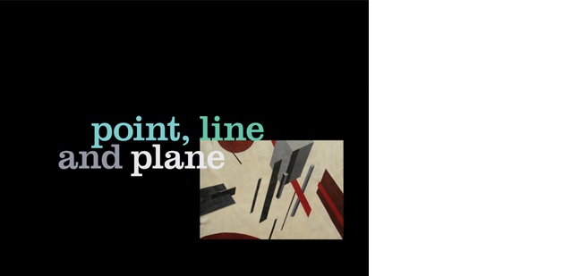
Once we got syllabus legalesus out of the way, I decided to jump into slides – which introduce the basic concepts of Point Line and Plane from the Bauhaus. These are supplemented with images from Graphic Design: The New Basics and Point studies from Armin Hofmann’s classic Graphic Design Manual:

Graphic Design: The New Basics by Ellen Lupton and Jennifer Cole Phillips
Princeton, ©2008, ISBN: 978-1568987026

Graphic Design Manual: Principles and Practice by Armin Hofmann
Braun, ©1965, ISBN: 978-3721200065
We start with Points (which will be our first assignment). We talk about abstraction. We discuss Kazimir Malevich (1878–1935) and his radical ideas, Suprematism, and settle on his Black Circle, a Point piece. We talk about feelings:

Kazimir Malevich, Black Circle, 1915
How we want to swat it back in place. Cause it’s bugging us.
We discuss how humans tend to organize materials when asked to place them in a given space. With the Malevich Black Circle being a creative counter to this.
‘Malevich is long dead. And as you can see, a hundred years later, he’s still fucking with you.’
They get it – I take them thru multiple sides showing points in use, asymmetric layouts (they don’t all get those, not quite yet) – then I give them their first assignment:
POINT ASSIGNMENT
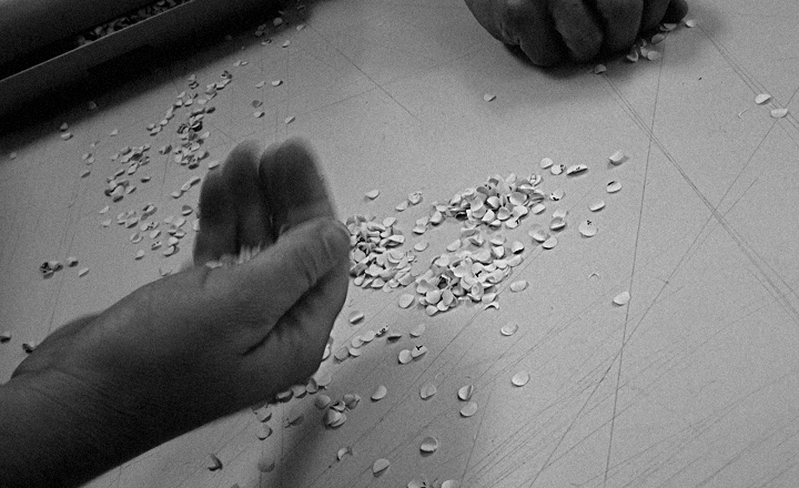
I dump a pile of punched holes – and have students use the holes to create TENSION in five drawn out 5x5 inch squares.
They can add colour and other elements, but they need to create TENSION in these studies.
This is their homework.
Plus READ Design Basics Chapter 1, pages 4–5; 18–25
And find online and watch
Genius of Design Episode 1: Ghosts in the Machine [BBC]
Tuesday, we’ll see if this will work or if something – fear, uncertainty, doubt, abstraction-phobia – will get in the way.
—steve mehallo
co
nti
nue
read
ing —
forward to BAU2 • • •
PLEASE SUPPORT FLOMM
DONATIONS DISCREETLY ACCEPTED


